
Univ
Construction chemicals & building materials
Client: Univ chemical & adhesives, India
Industry: Construction / Building materials
Location: Ahmedabad, Gujarat, India
Our role: Packaging for construction materials
Design: Kruti Raval, Pramit Raval
Management & Coordination: Rushabh Shah, Pramit Raval
Website: univchemical.com
Instagram: univ_chemical
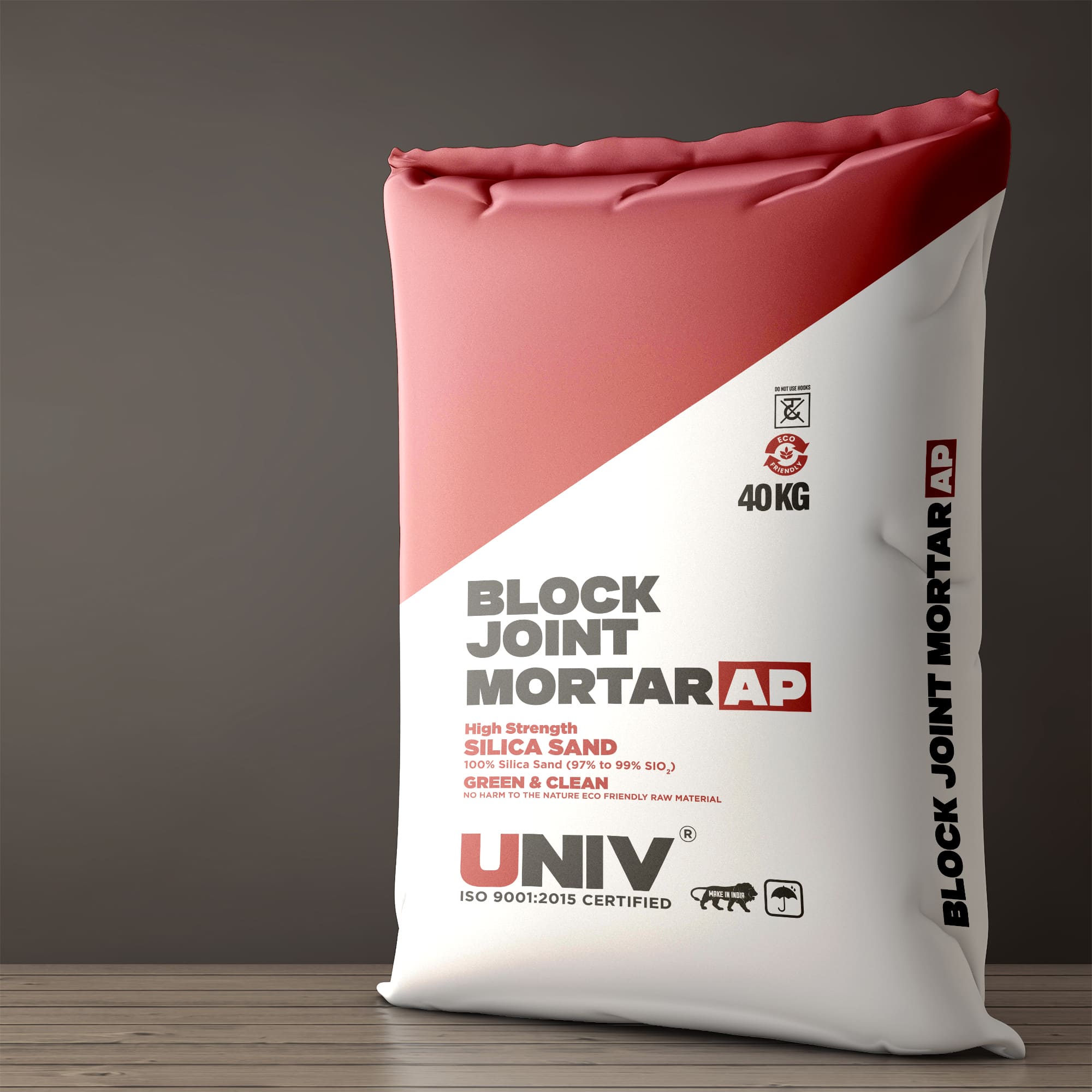
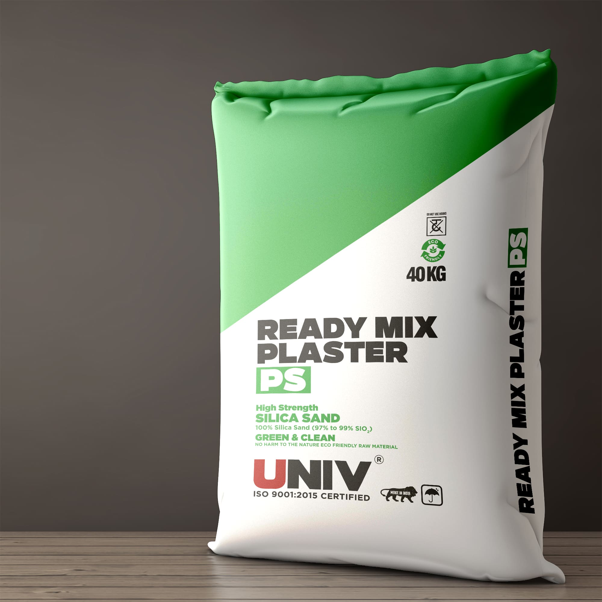
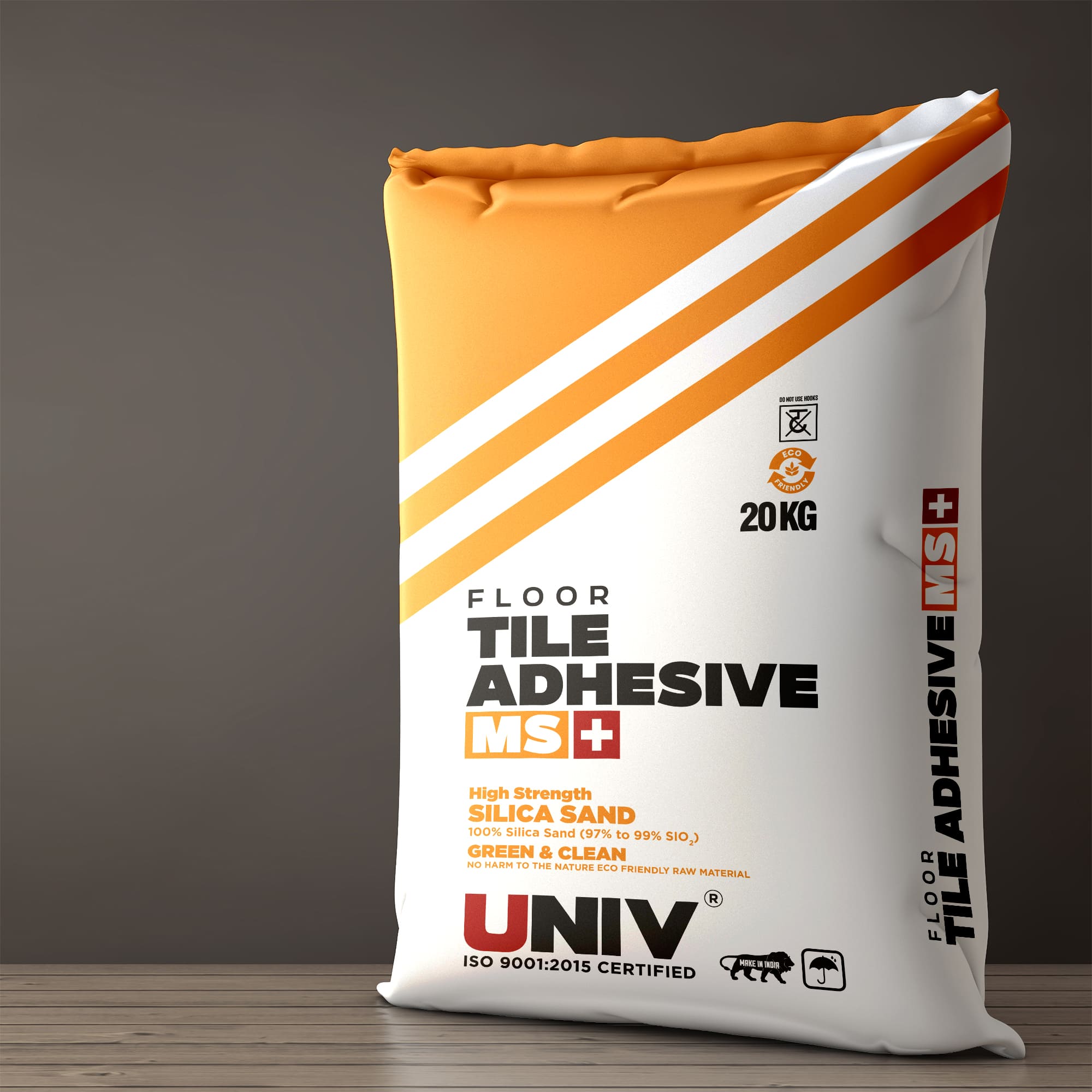
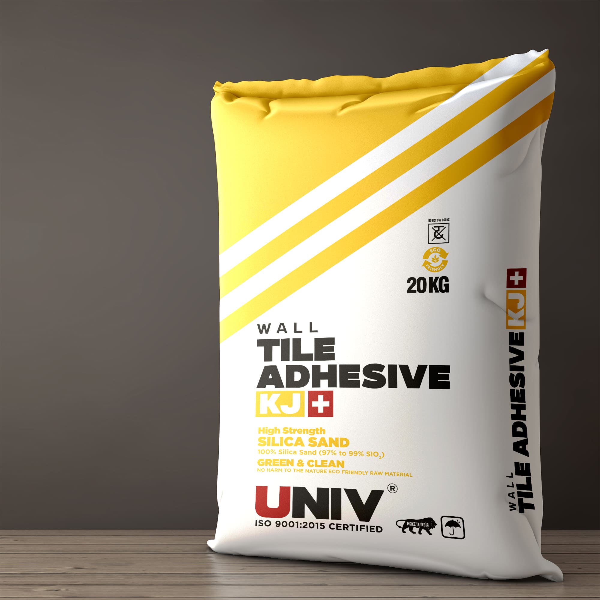
Overview: Bag packaging design for UNIV’s construction materials, where each product is easy to tell apart on busy sites.
Overview
Univ Chemical & Adhesives is a manufacturer based in Ahmedabad, Gujarat, India. The company produces specialty cement-based products and high-purity silica (SiO₂ 98%+) construction compounds. We designed the packaging system for their full range of product bags. The client came to us through a referral from a previous client.
Challenge
The client has deep expertise in his products and clear knowledge of what the packaging must communicate. He needed a design partner to turn that into a complete visual system.
The main challenge was the range itself. Several products are closely related, and their packaging needed to look alike, yet each one had to be identified without confusion. These bags are handled quickly on busy construction sites, where a mix-up costs time and money. Our first insight was that the design itself should separate the products, not small print.
Approach
We created one consistent design system so the whole range reads as a single family. Each product is then set apart by two clear signals: its own colour and its own stripe pattern. A large product name on the front confirms the contents. We chose strong, bold colours and typography because they stay clear from a distance and are easy to remember. The result is packaging that anyone can recognise quickly, whatever their background or experience.
Outcome
The packaging gives the range a clear, consistent identity, and each product can be identified at a glance. The client is very pleased with the result.