
Shubha Vihar
Luxury villas at the foothills of Tirupati
Client: Shubha Vihar, via The Build Workshop & Happy Castles Pvt. Ltd., Hyderabad, Telangana, India
Industry: Real estate / Residential villas
Location: Tirupati, Andhra Pradesh, India
Our role: Brochure design, printing
Design: Kruti Raval, Sonar Raval, Pramit Raval, Tulja Bhavani Reddy, Akella Adarsh
Management & Coordination: Kruti Raval, Pramit Raval, Tulja Bhavani Reddy, Akella Adarsh
More from The Build Workshop: Ayati Lake View, Ayati Hill Top, Score Sports Bar, Chapattos, FSM Jubilee hills, FSM banjara hills, Rangrez, Syala, tabula rasa
Architects: Keystone Design Studios, Hyderabad
Website: www.thebuildworkshop.co
Instagram: the.build.workshop
Overview: A printed brochure for a gated villa community near Tirupati, designed around the green setting of the site.
Overview
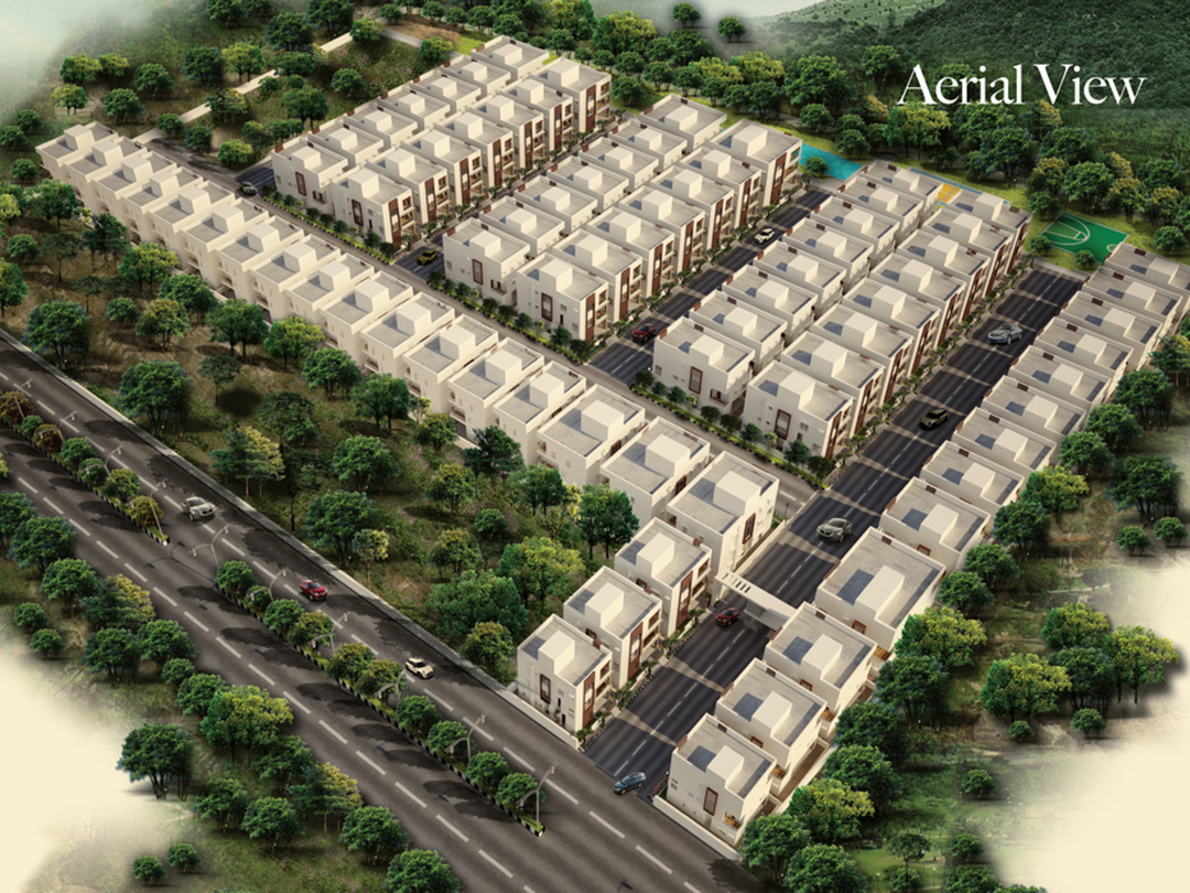
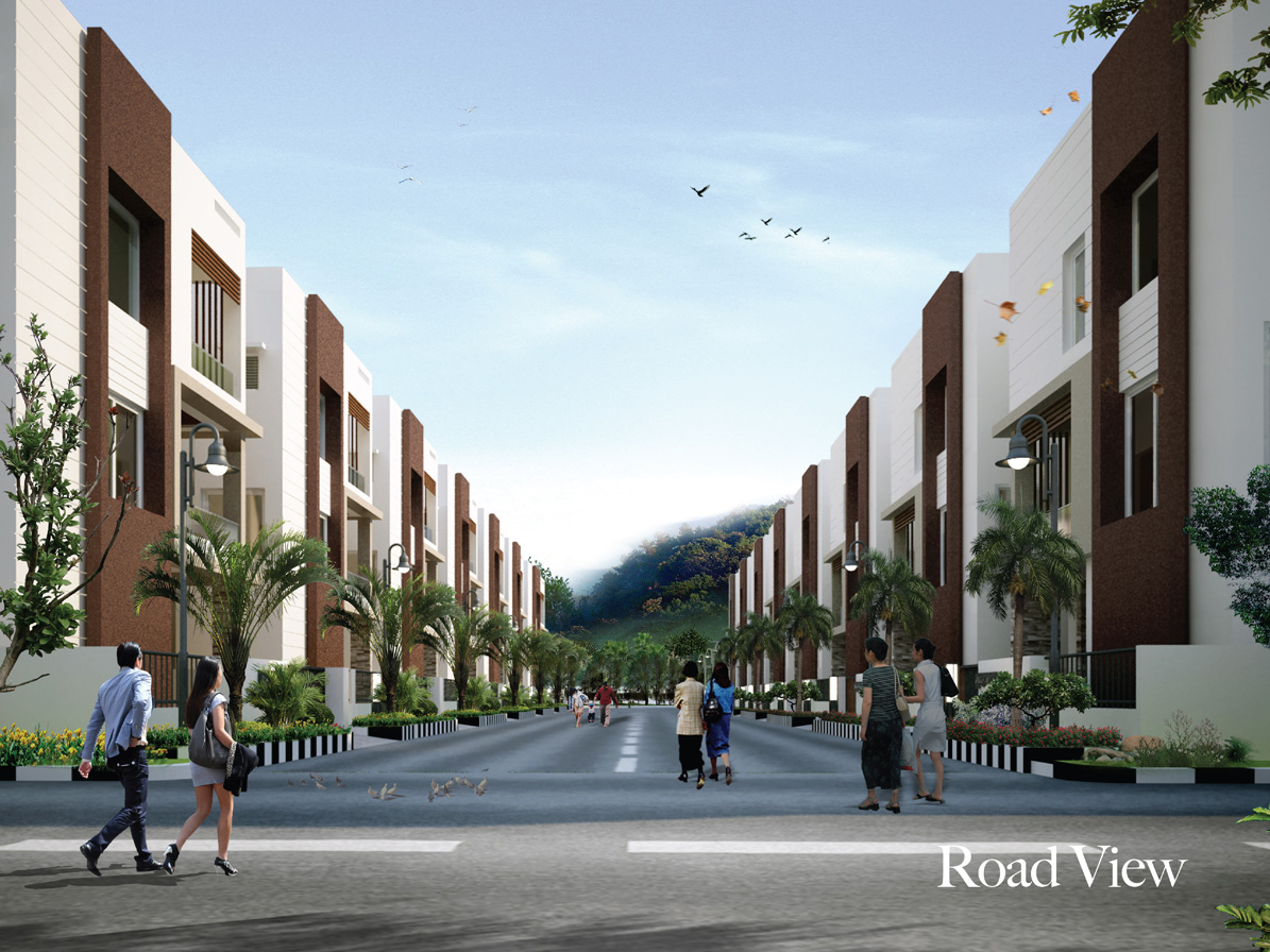
Shubha Vihar is a gated community of 75 luxury villas near Tirupati, at the foothills of Lord Venkateswara. The project was developed by Happy Castles Pvt. Ltd., with architecture by Keystone Design Studios, Hyderabad. It came to us through Build Workshop, and it was one of our first projects in the early days of our studio. We designed the full brochure and took it through to final print.
Challenge
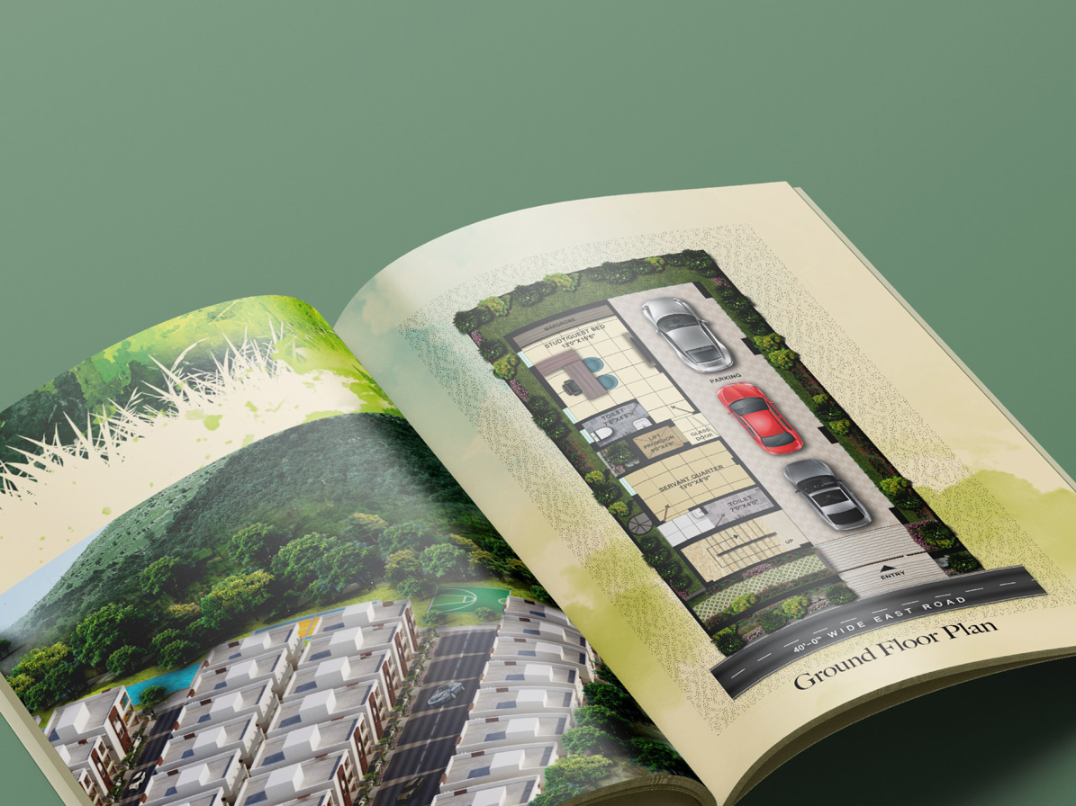
We received only basic information about the project. The brochure still had to carry a lot of content: the key plan, the site plan, the villa designs, floor plans and technical specifications. The villas come in three facings (East, West and North), and each has its own plans.
The client had one clear request: the brochure should look green. The site sits among greenery, and the brochure had to show that feeling before a buyer visited. The challenge was to keep it soft and natural, and still clear and easy to use as a sales tool.
Approach
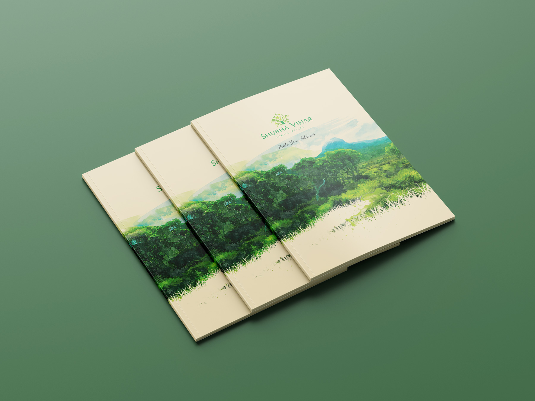
We started with the setting. Green became the main idea of the brochure, and we chose a calm look that matches the place.
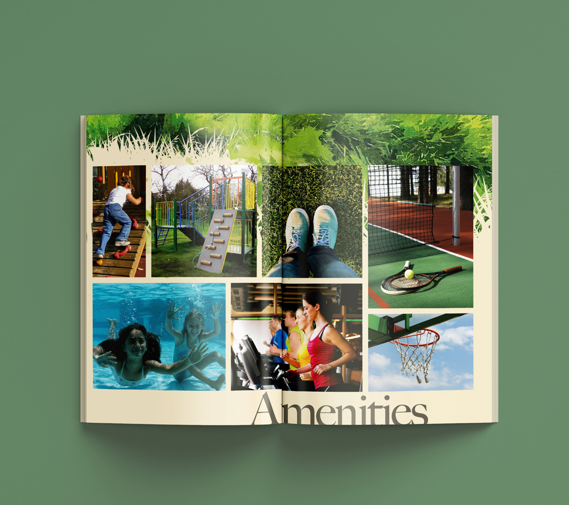
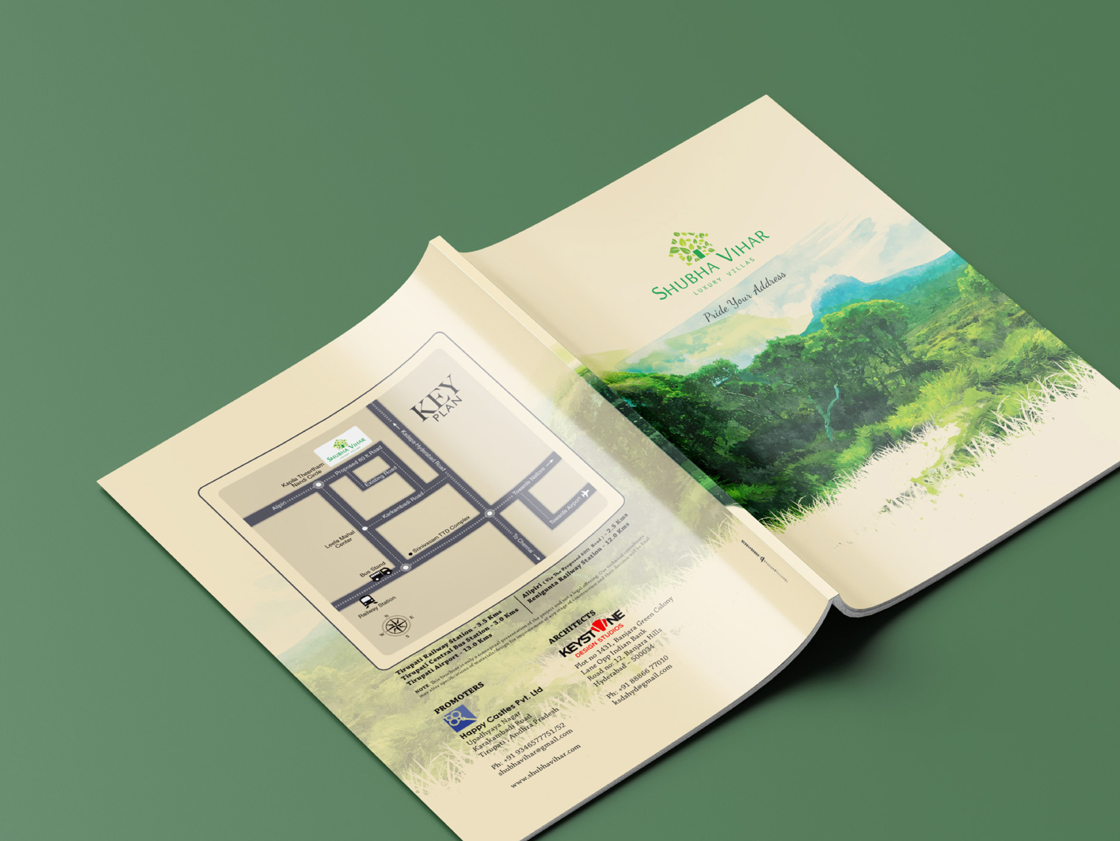
- Watercolour landscape. Painted forest, hills and grass run through the pages. The cover opens with a green hillside and the line “Pride Your Address”.
- Warm, soft background. A cream paper tone with light green and blue washes keeps the pages gentle and lets the greens stand out.
- One green identity. The logo, the headings and the icons in the specifications all follow the same green.
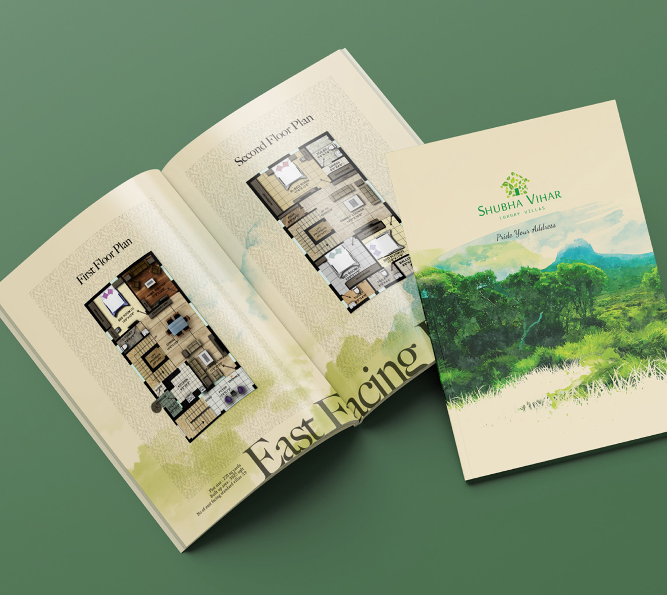
- Clear information. The key plan, site plan and specifications use simple layouts and clean icons, so technical content is easy to read.
- Villa pages. Each facing has its own page with the villa view and floor plans. The large headings (East Facing, West Facing, North Facing) make the pages easy to find.
Outcome
The brochure was designed, printed and delivered to the client. It gave the project a calm, green identity that matches its surroundings.