
Hakimi 53
Launch Brochure for an Integrated Township
Client: Hakimi Group, Gujarat, India
Industry: Real estate / Integrated township
Location: Ukardi Road, Dahod, Gujarat, India
Our role: Logo design, brand identity, brochure design, printed dummy
Design: Kruti Raval, Sonar Raval
Management & Coordination: Pramit Raval
Collaboration: Ar. Keyur Bhatt, I Design (Architect)
Overview: Hakimi 53 is an integrated township in Dahod, Gujarat, developed by Hakimi Group. It combines commercial shops and halls with luxury villas, planned by architect Ar. Keyur Bhatt of I Design. We created the project’s visual identity from scratch, from the logo to the launch brochure and its printed dummy.
Overview
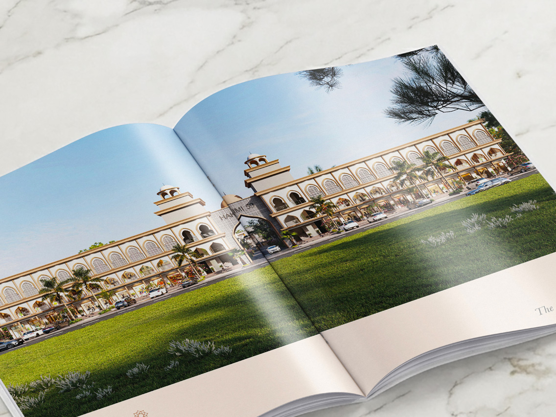
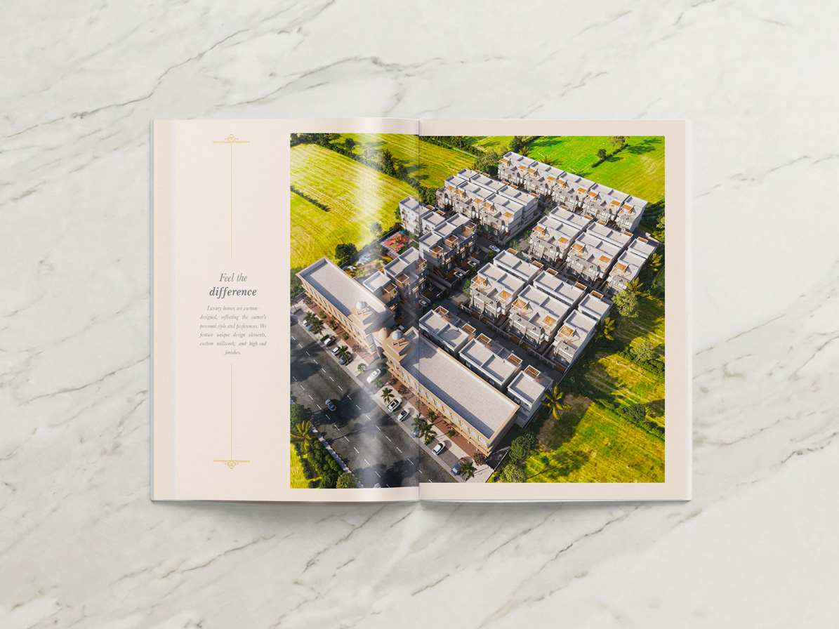
Hakimi 53 is an integrated township developed by Hakimi Group on Ukardi Road, Dahod. The project brings together a commercial block of ground and first-floor shops, large upper-floor halls, and a community of private villas.
The project came to us through Ar. Keyur Bhatt of I Design, an architect we have known for many years. It was our first project together. We were responsible for the full visual identity: the site logo, the colour palette, the brochure layout and a printed dummy for client presentations.
Challenge
The main challenge was time. The project ran for a long period, and the architectural plans were refined several times along the way as the project developed. Each revision meant updating floor plans, layouts and content without losing consistency.
The second challenge was presentation. A township sells on trust and on how well buyers can picture it. The brochure had to carry a lot of information, such as elevations, aerial views, shop plans and villa plans, while still feeling calm, premium and easy to read.
Approach
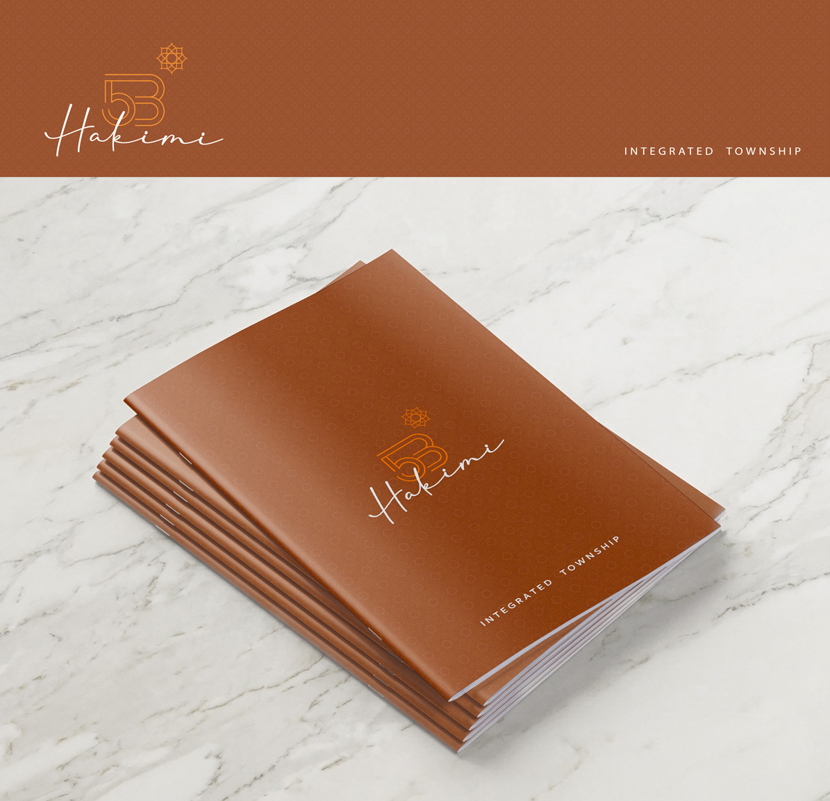
We started with the logo. The mark combines the number 53 with a fine geometric star motif, paired with a flowing script wordmark. It gives the township a personal, elegant signature.
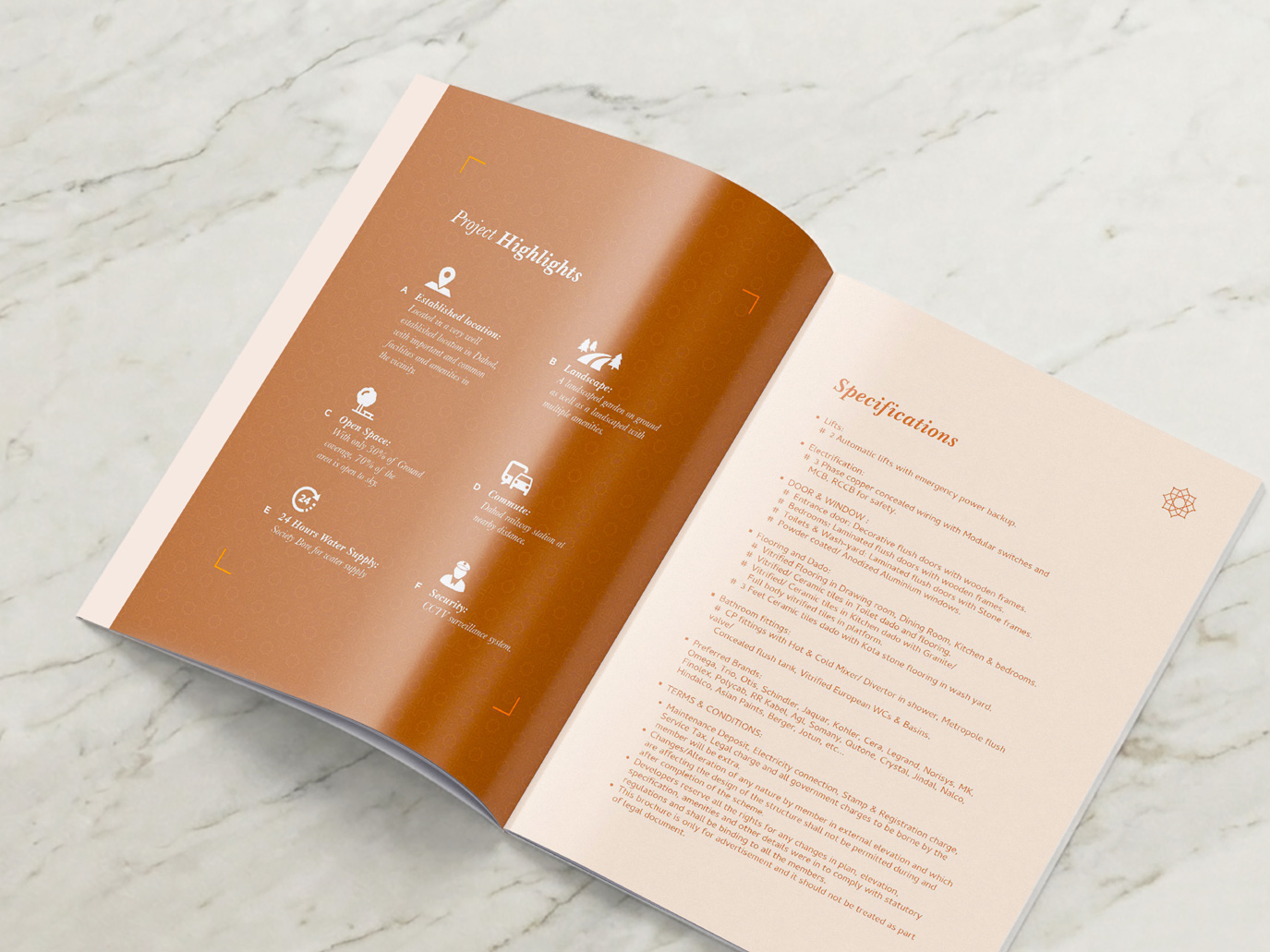
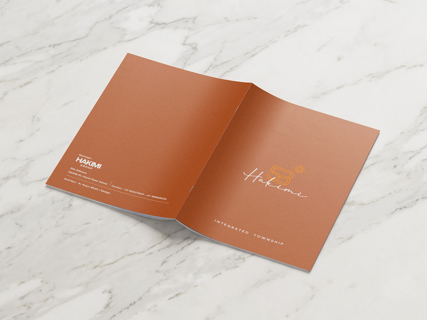
For colour, we chose a warm terracotta and copper tone with soft peach and cream pages and orange accents. This draws from the warmth of the architecture and keeps the brochure rich without being heavy. A subtle repeating pattern on the covers and a geometric motif, taken from the logo, run through the pages as a quiet design thread.
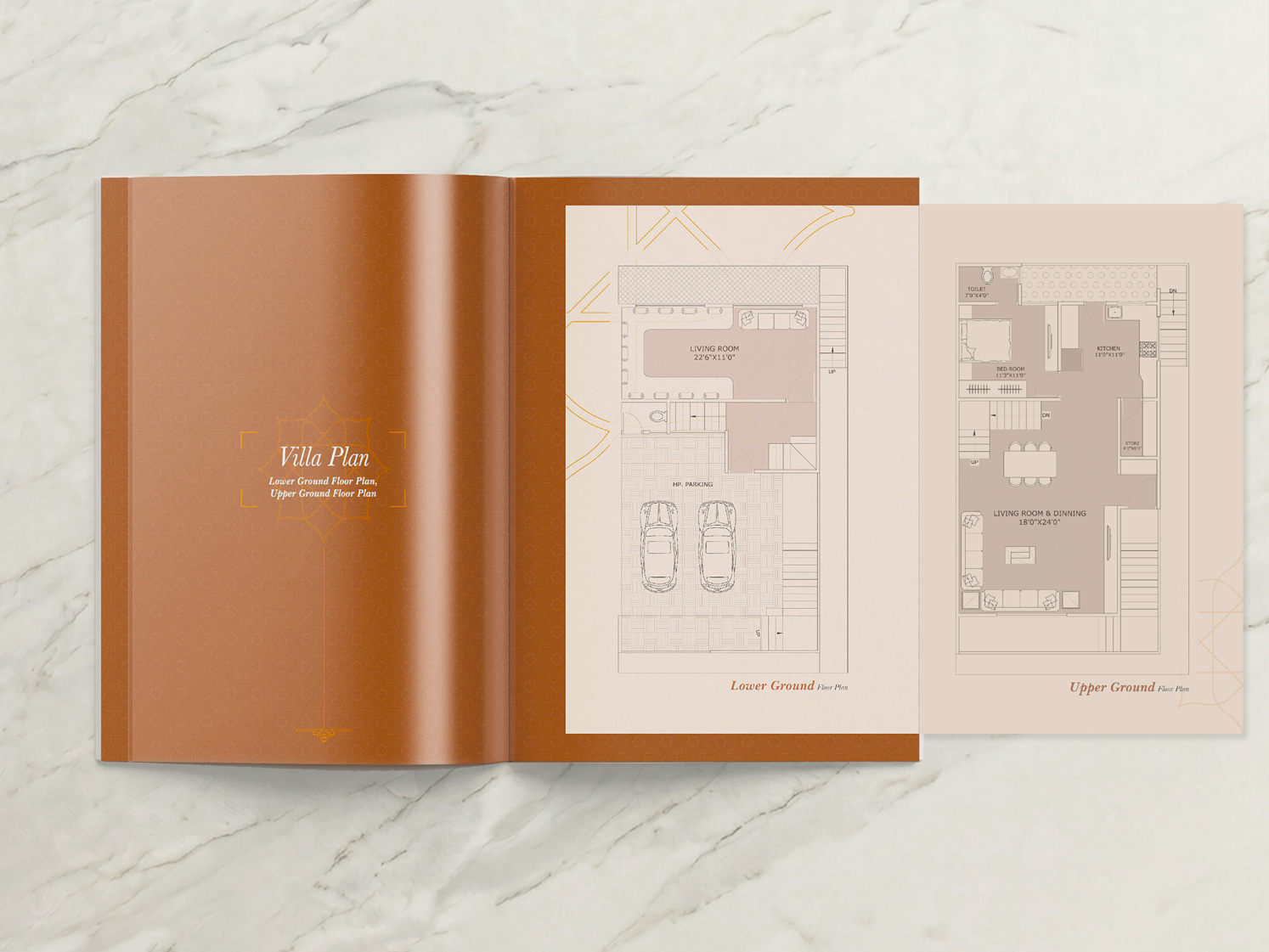
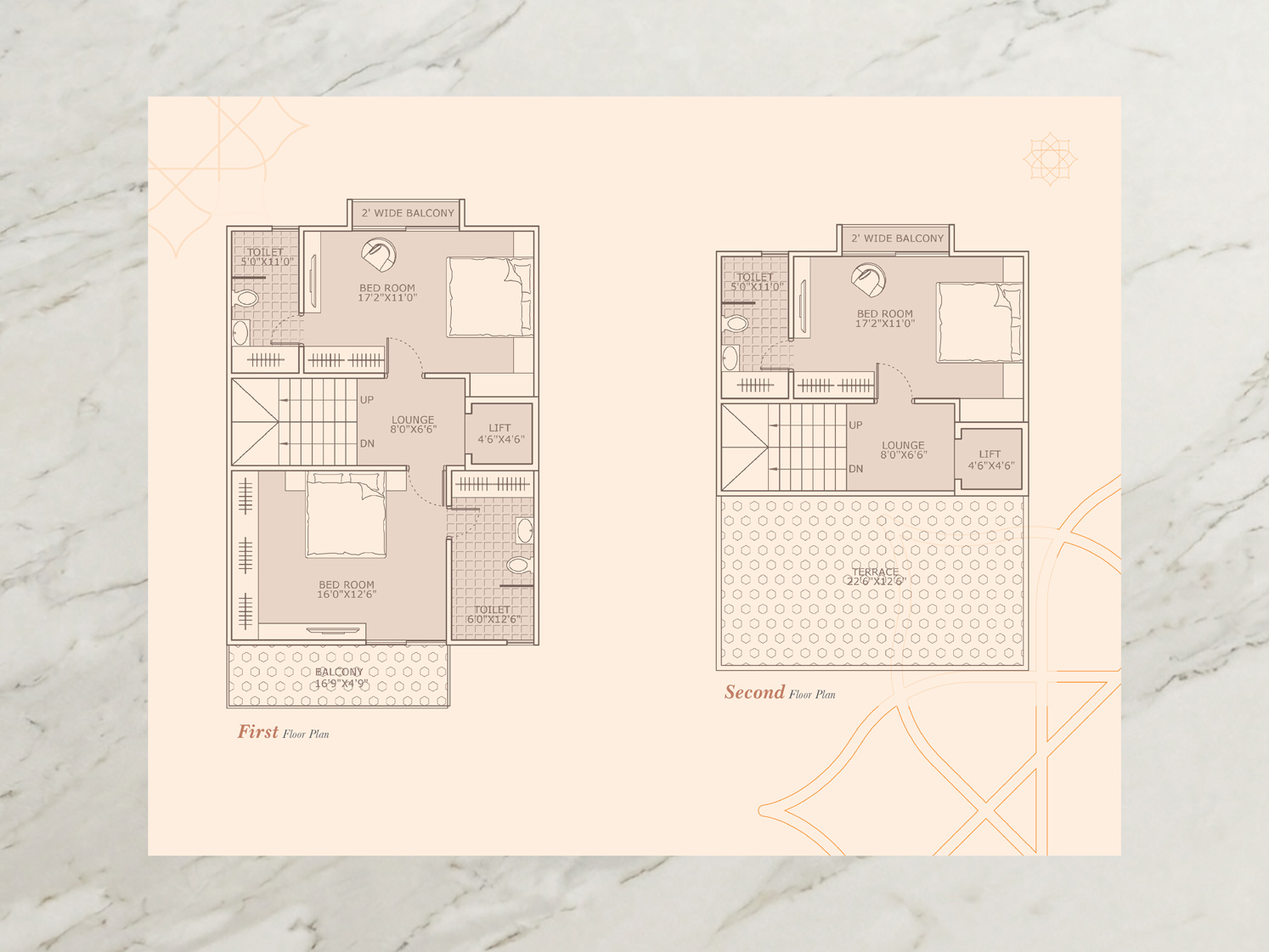
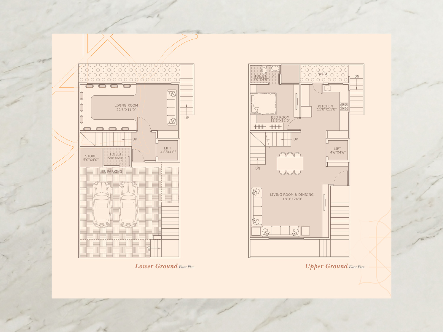
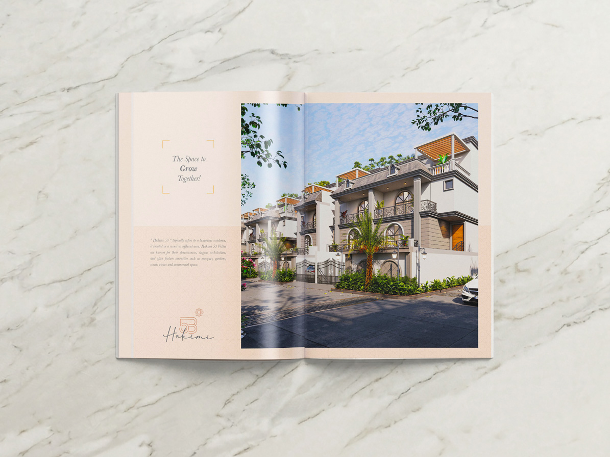
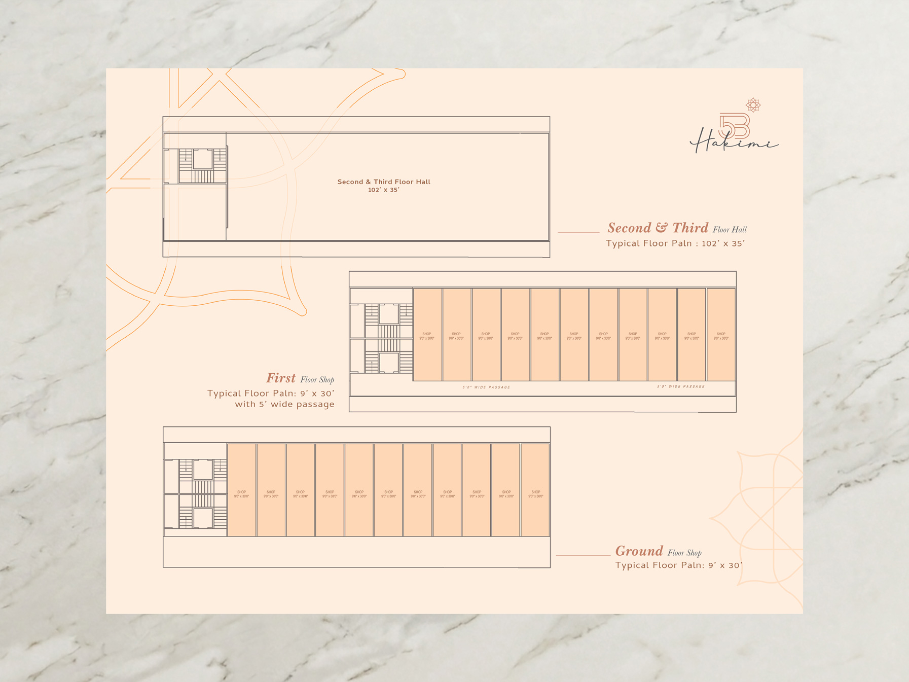
The layout was built around clarity. Project highlights, specifications and plans are given their own pages. Floor plans for the shops, halls and villas were redrawn in a clean, soft grey style so they match the brochure instead of looking pasted in. Large architectural visuals are given full spreads, so the project is shown at its best.
Because many buyers find it hard to judge a project from files alone, we produced a printed dummy of the brochure. Holding the real thing in hand helped the developer and the clients understand the design, the paper feel and the flow before final printing.
Outcome
Hakimi Group received a complete and consistent identity for the township: logo, colour system and a print-ready launch brochure, supported by a physical dummy for presentations. The brochure presents the project clearly, from the first cover to the last plan. It gives the developer a professional tool for conversations with buyers and gives the project a strong visual identity from day one.