
Back Local
Speciality Coffee House
Client: A Unit of Isana Ventures, Hyderabad, India
Industry: Food & Beverage / Coffee
Location: Secunderabad, India
Our role: Brand identity design, Printing
Design: Kruti Raval, Sonar Raval
Management & Coordination: Kruti Raval
More from Isana Ventures: Anuttama, Marici, Roobaroo
Instagram: backlocalcoffeehouse
Overview: Brand identity design for Back Local, a speciality coffee house in Secunderabad, India.
Overview
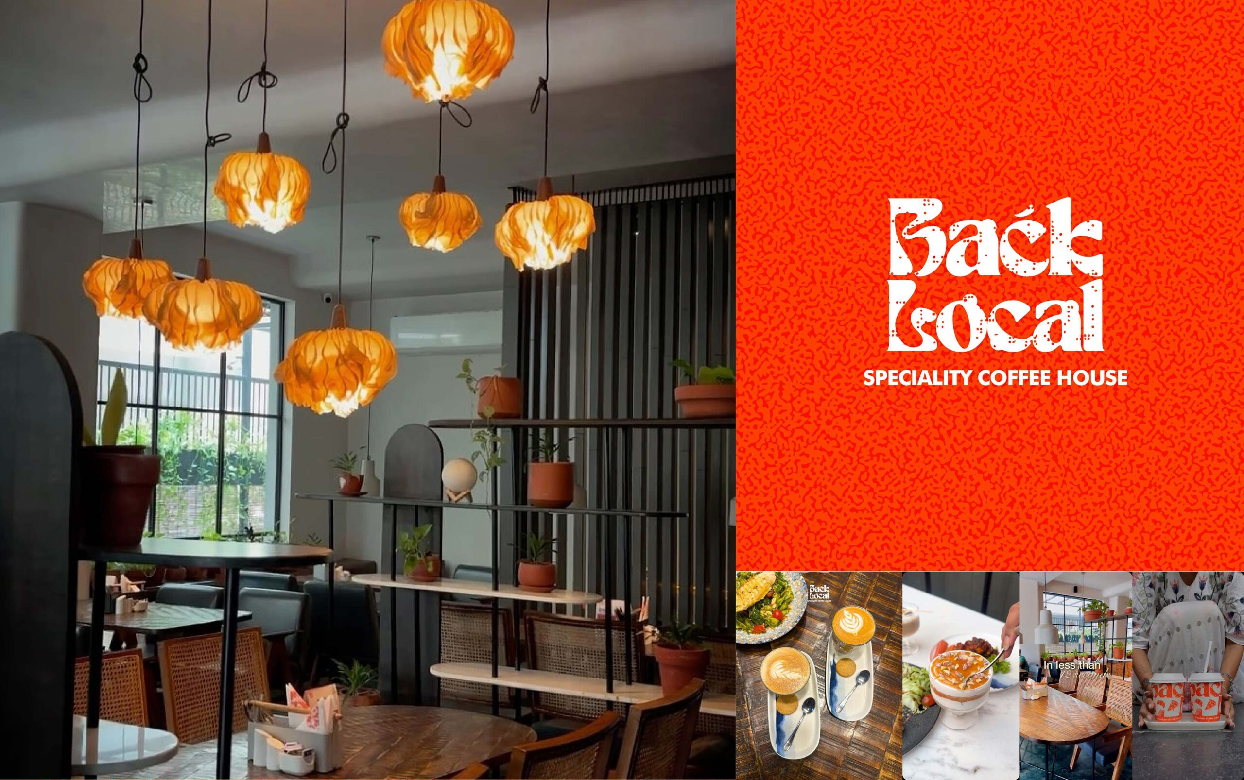
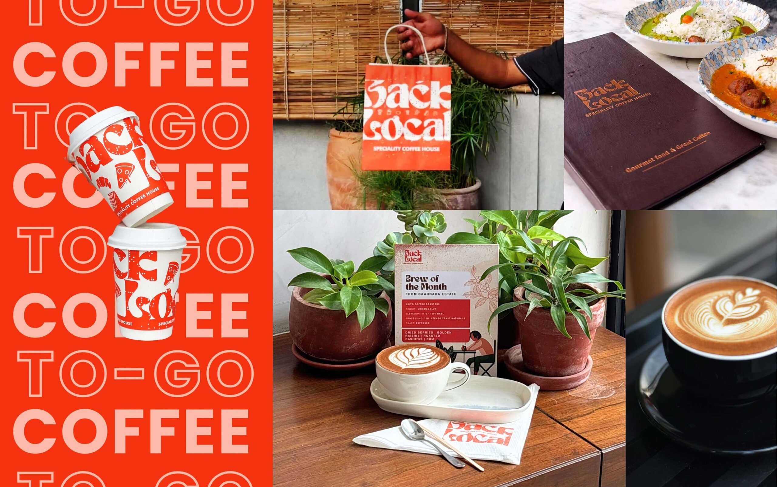
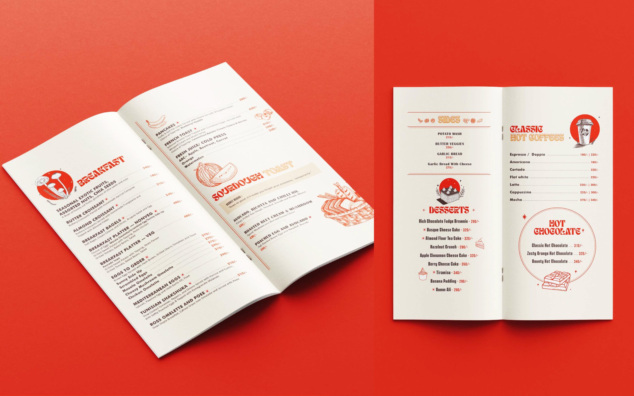
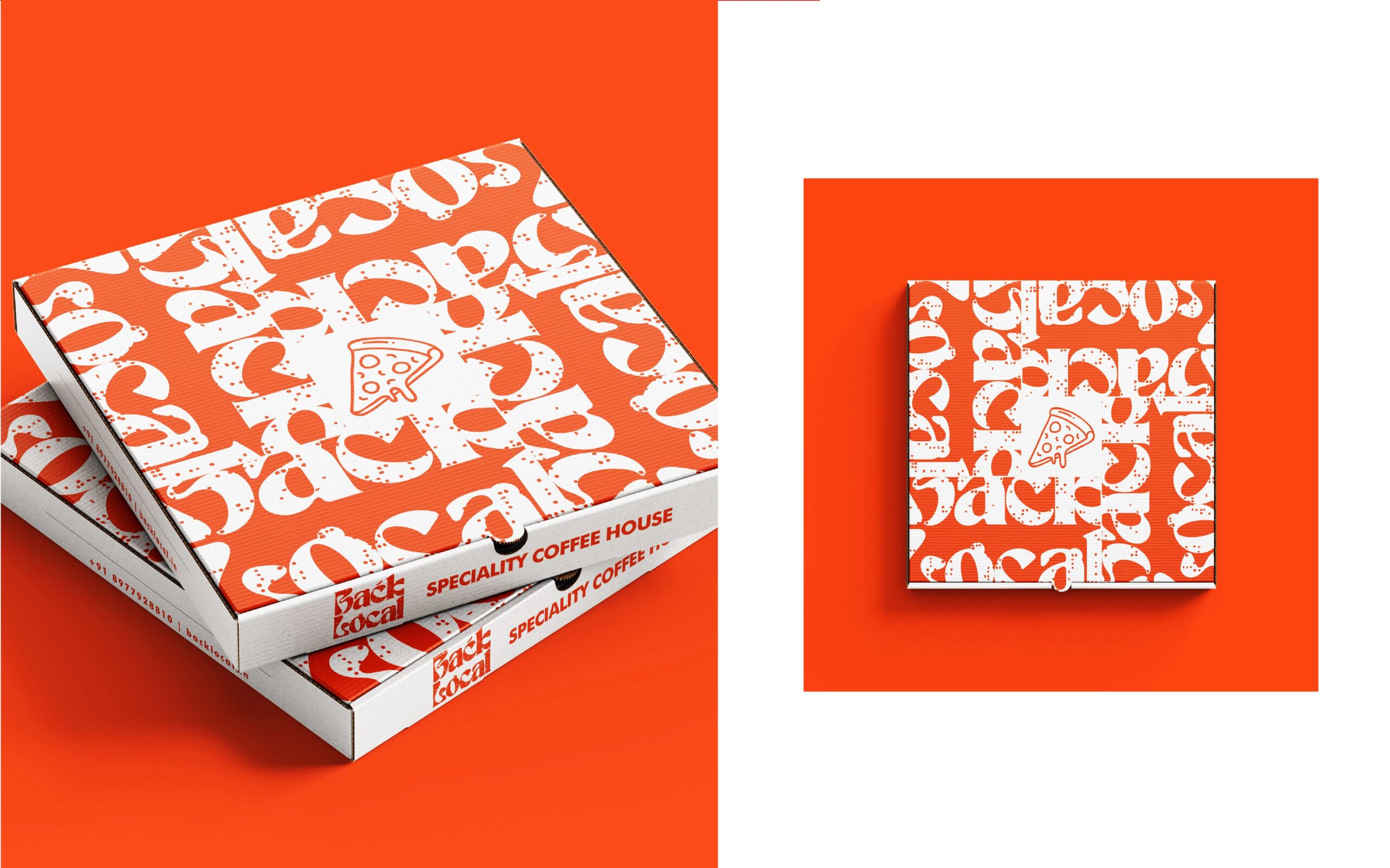
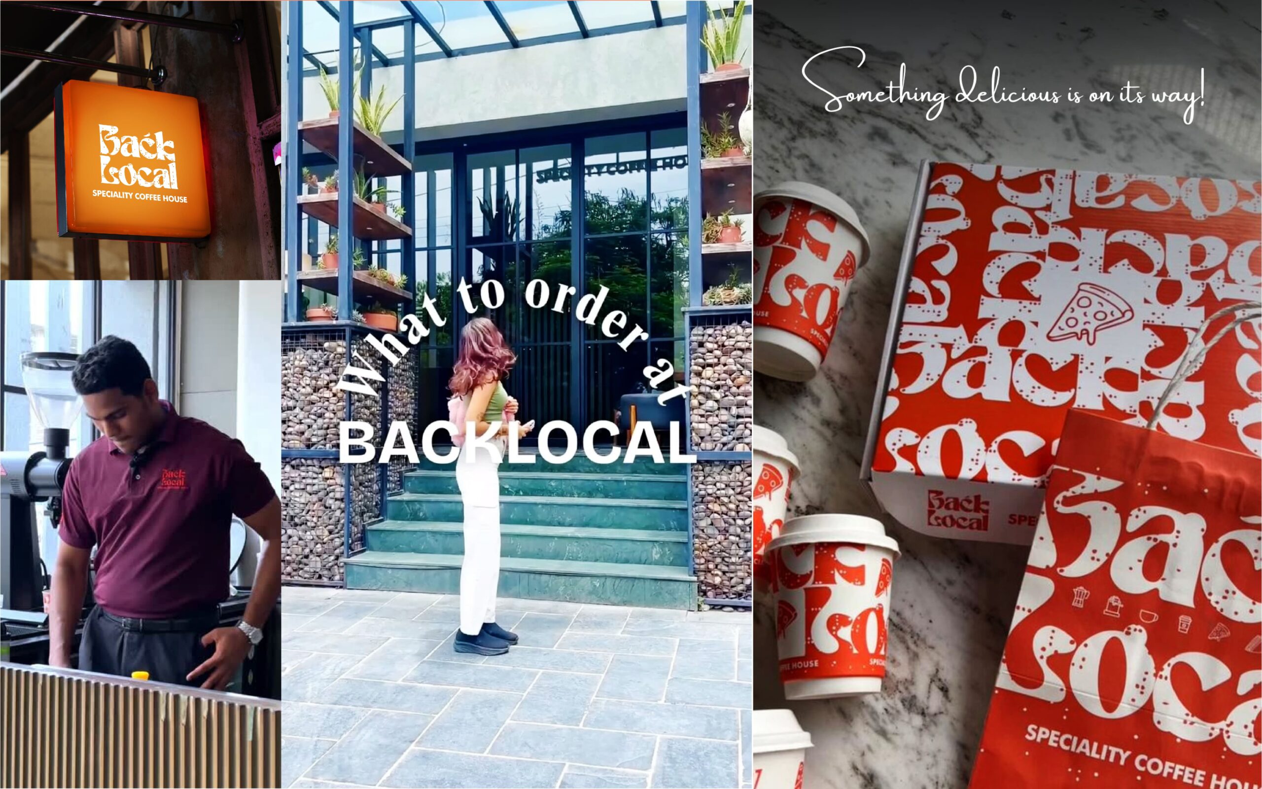
Back Local is a speciality coffee house in Secunderabad, Hyderabad, India. The owner has been our client for more than 15 years, and we have worked with him on many kinds of projects, from logo design to full branding. For this cafe, we created the complete brand identity: the logo, typography, colour, and the design of everything the customer sees and touches, from menus and cups to napkins, bags and pizza boxes.
Challenge
The owner speaks little, but he knows exactly what he wants. He gave us full creative freedom, with one condition: the design had to solve his purpose.
That purpose had three parts:
- The cafe serves a range of local coffees from near Hyderabad, and the owner buys the coffee directly from farmers.
- He wanted a natural, peaceful space with greenery. The interior and furniture designer joined the project, so the brand and the space would feel like one.
- The cafe is in a busy area, so it had to stand out both outside and inside.
Our first question was how to make a brand loud enough to be noticed in a busy place, yet still natural and calm.
Approach
We set two targets: bold typography and vivid, eye-catching colour. The colour is full of life, but not neon.
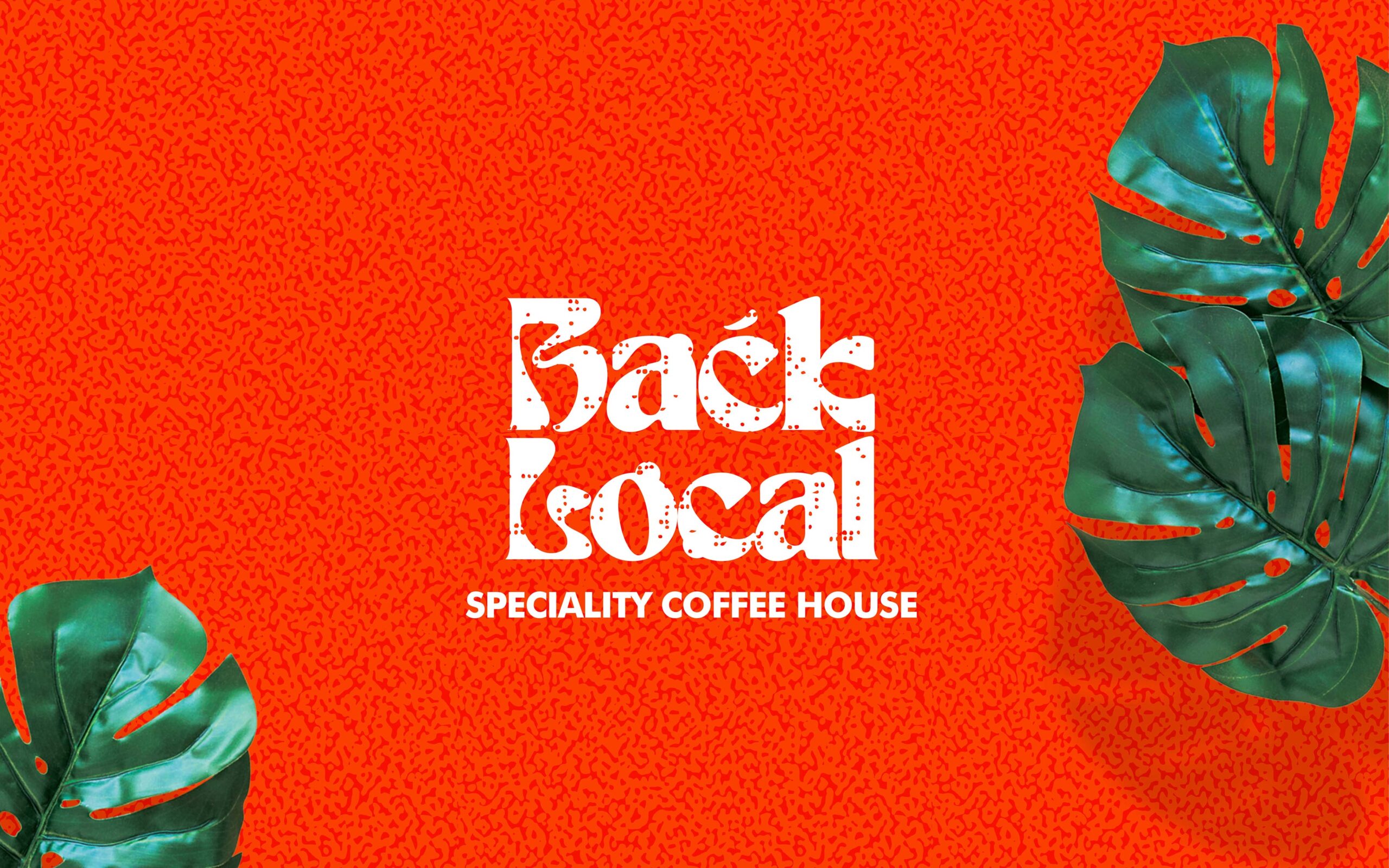
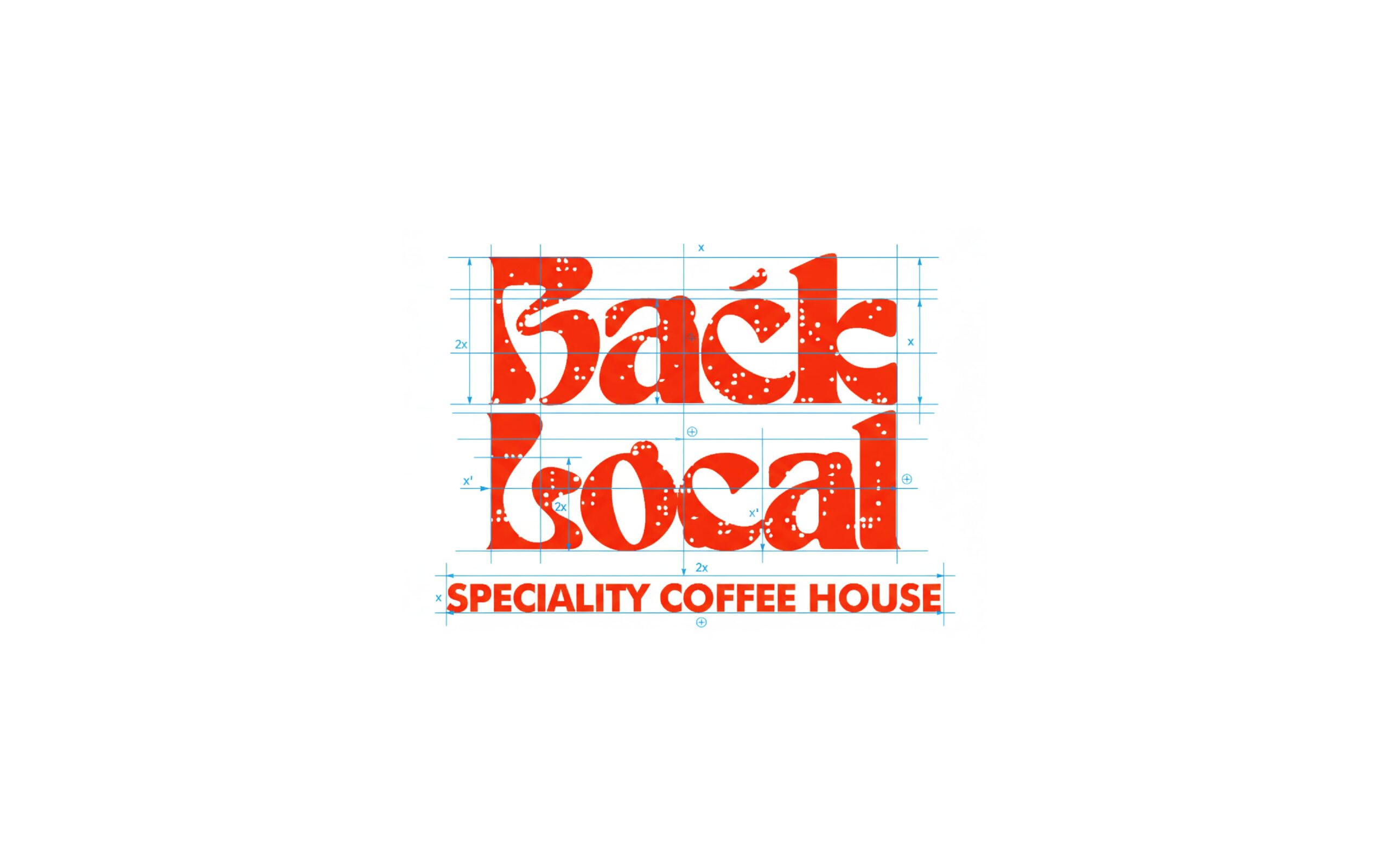
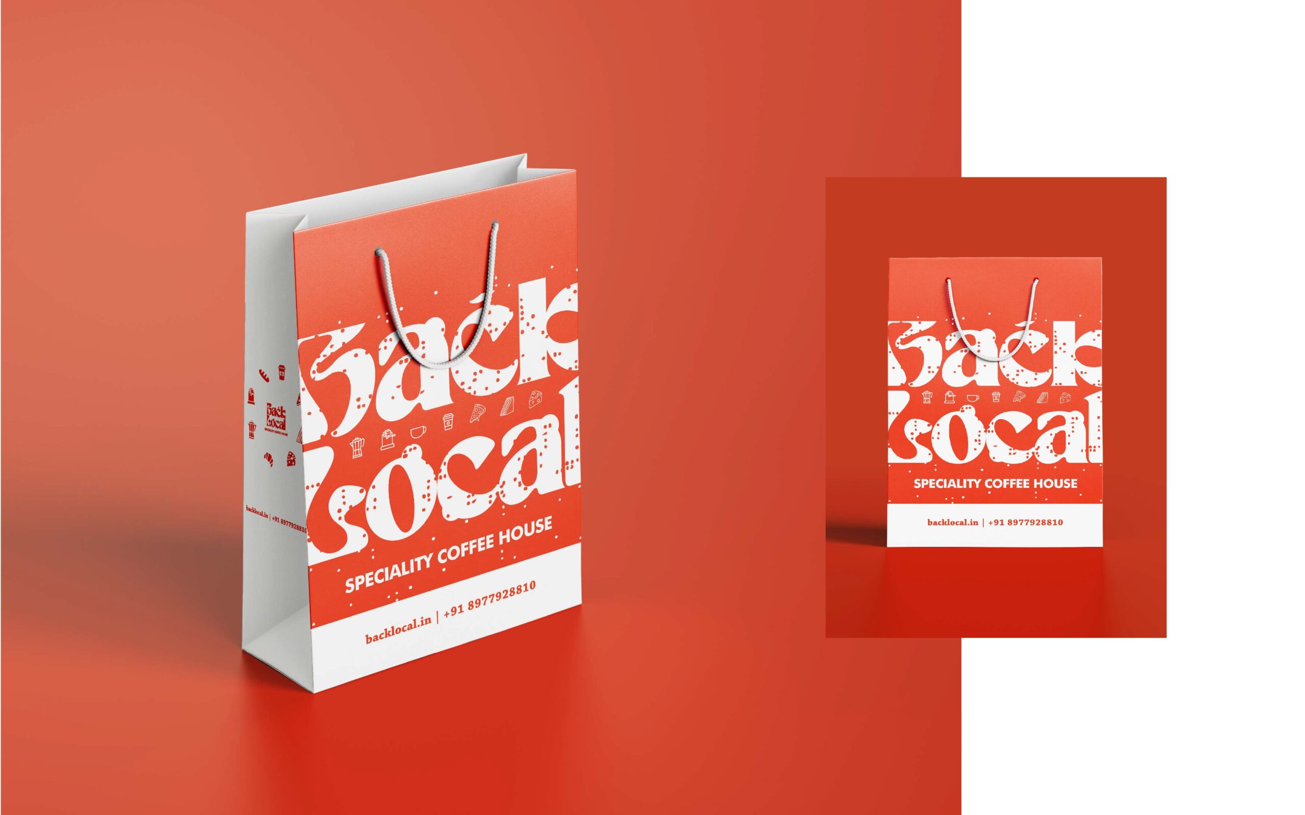
A logo with a reason behind it. The typography is bold and unique. The fine dots inside the letters represent bubbles of coffee. We built the logo on a proportional grid, so the name and the line beneath it stay balanced. Nothing is random: every shape and texture has a thought behind it.
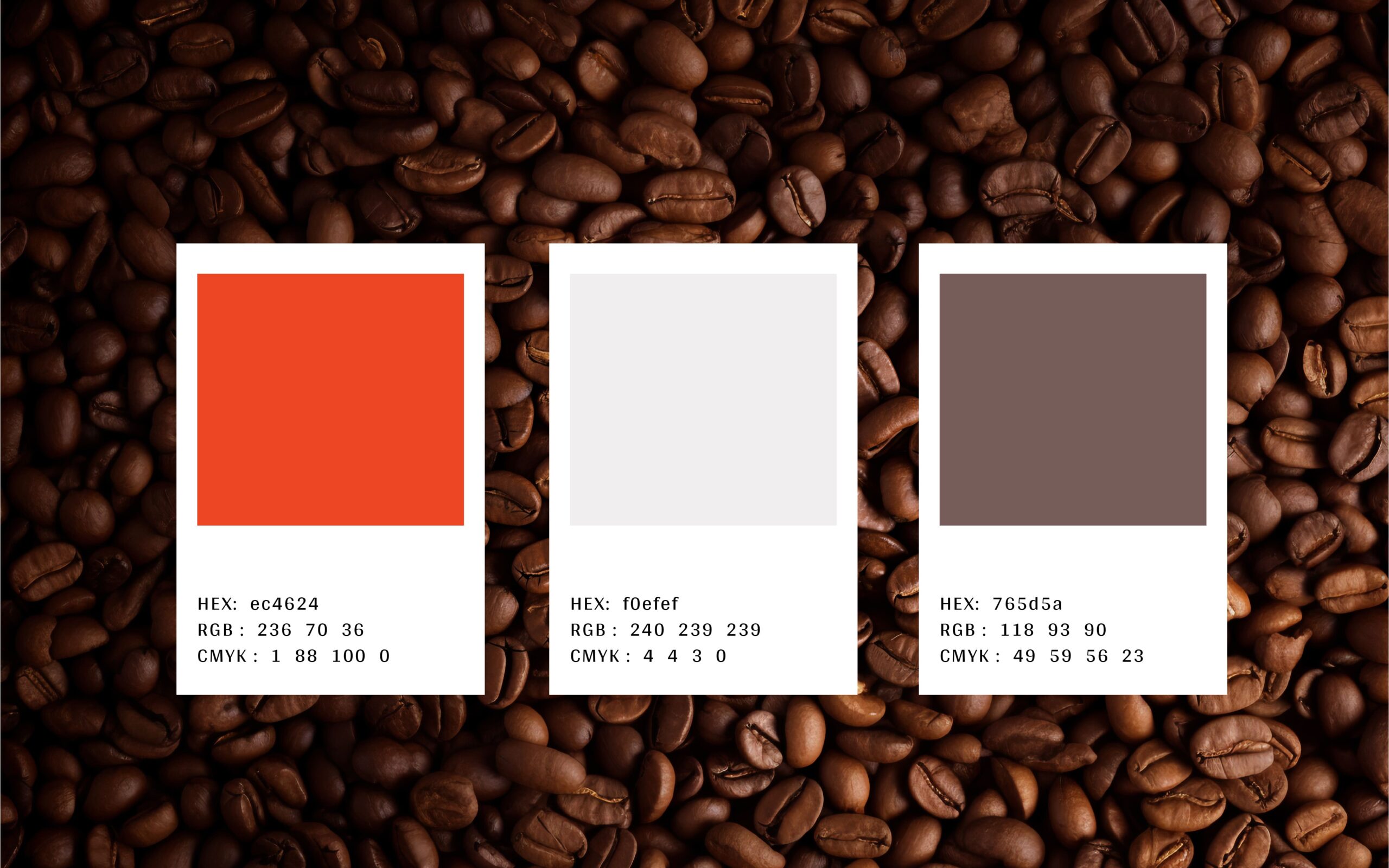
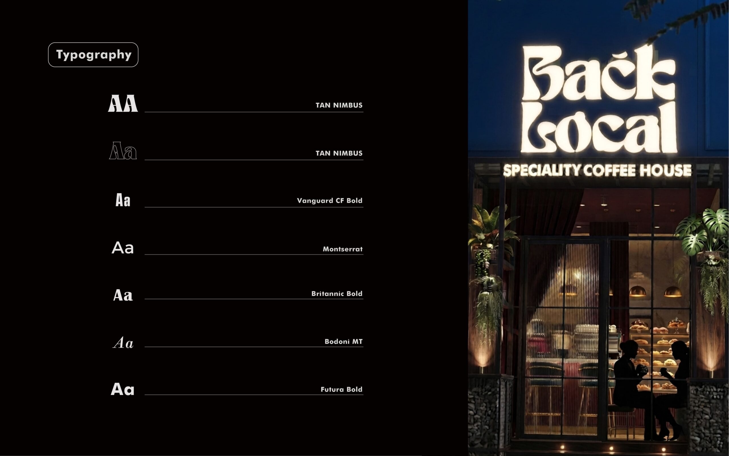
Orange against green. We chose a vivid orange so the logo stands out clearly among the green of the space. It also stays easy to see at night.
One look across everything. From the logo, we built a simple colour palette, a typography set and a repeating pattern. Menus, cups, napkins, bags and pizza boxes all use them, so everything feels clean and appetising, whether you are reading a menu or holding a cup.
Design guidelines. We prepared guidelines for the cafe to follow, so the brand stays consistent.
Outcome
Back Local now has a complete brand system: logo, typography, colour palette, repeating pattern and design guidelines. The bold typography and vivid orange make the cafe easy to notice in a busy area, in the day and at night. Every material, from menus and cups to napkins, bags and pizza boxes, looks like part of one family, and the cafe follows the guidelines to keep it that way.