
24 Carat Gold Coin
Luxury 3 & 4 BHK Apartments
Client: Prakalpan Architects, Ahmedabad, India
Industry: Real Estate
Location: Navrangpura, Ahmedabad, India
Our role: Brochure design, Printing
Design: Kruti Raval, Sonar Raval, Pramit Raval
Management & Coordination: Kruti Raval, Pramit Raval
More from 24 Carat: Onyx Apartments, Saibaba Apartments, Bansidhar Apartments, Saffron Apartments
Architect: Prakalpan Architects
Website: prakalpan.com
Instagram: prakalpan.architects
Overview: Brochure design for Gold Coin, a luxury apartment project by 24 Carat in Navrangpura, Ahmedabad.
Overview
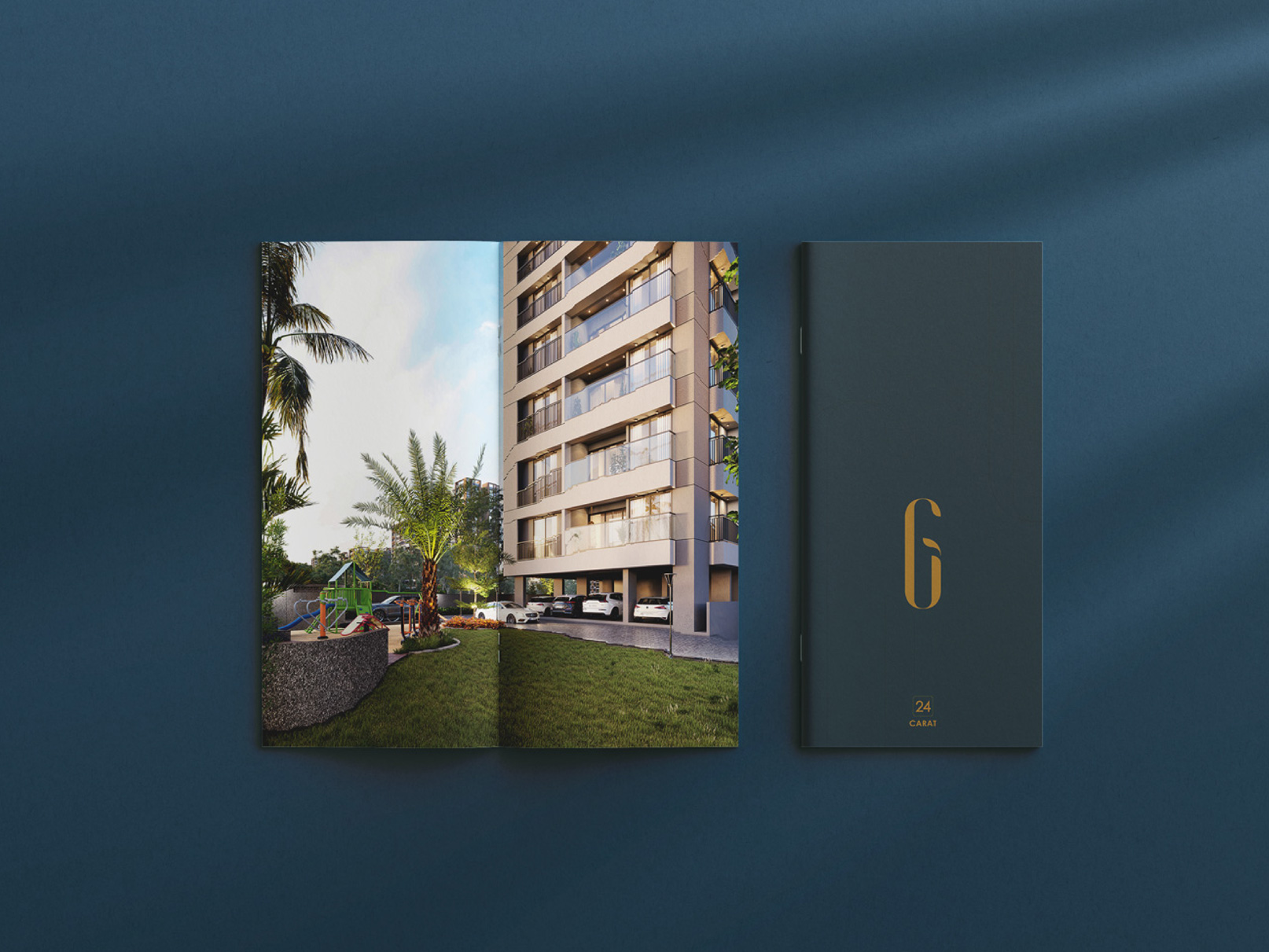
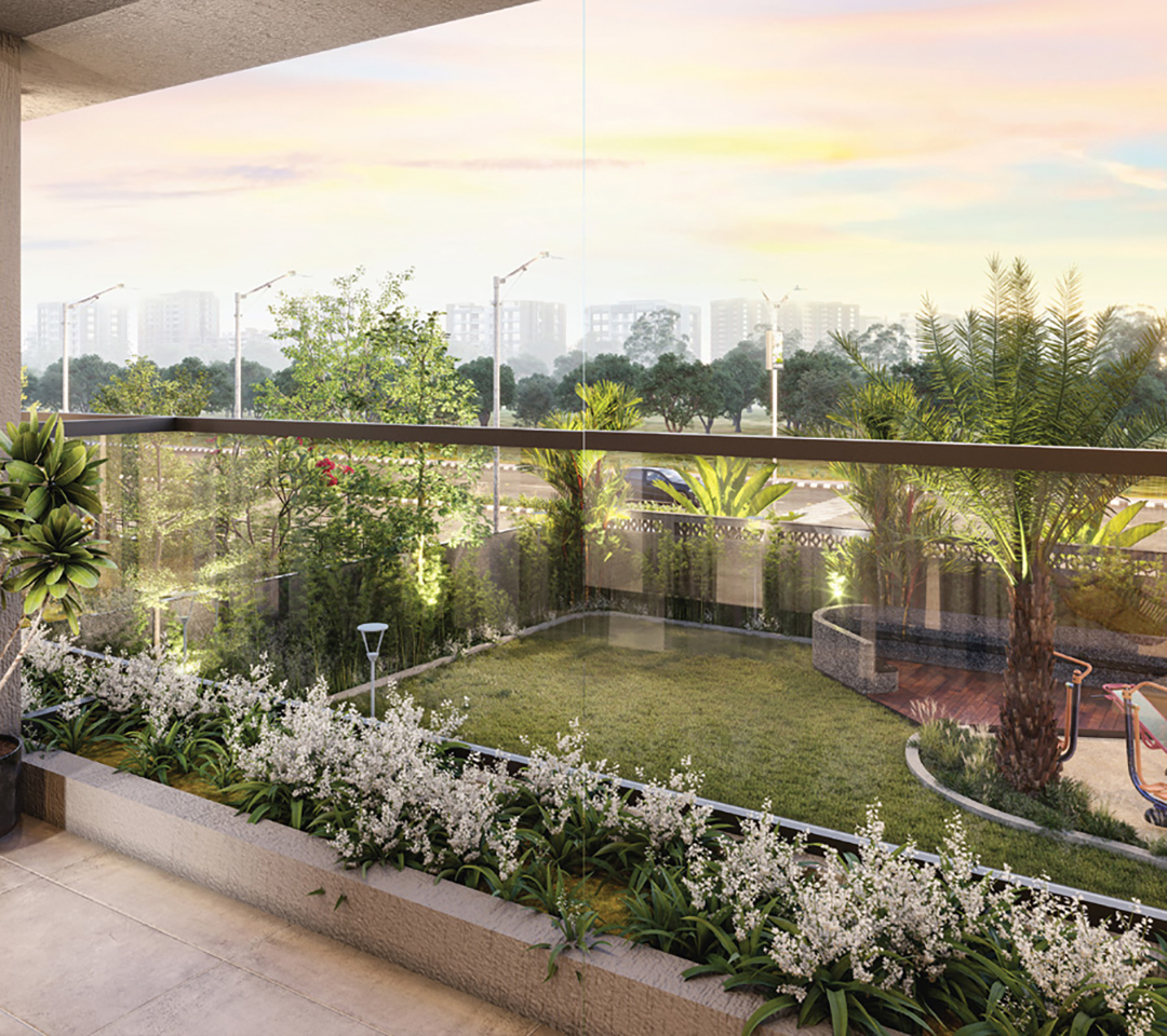
Gold Coin is a luxury apartment project in Navrangpura, Ahmedabad, developed by Chavda Developers and Kamal Corporation under the 24 Carat banner. It offers 3 and 4 BHK apartments, designed by Prakalpan Architects. The client has been with us for more than 20 years, and we have worked together on many projects. For Gold Coin, they shared the project details and gave us the freedom to shape the rest. We created the logo, colour palette, look and feel, and the full brochure, from the first sketch to the final print. A few decisions were taken together, as always.
Challenge
24 Carat is a trusted name in the area, with five completed projects in 15 years. Gold Coin needed an identity that felt premium and valuable, yet calm and refined. The brochure also had to present plans, specifications and location clearly, so a buyer could understand the project at a glance.
Approach
An identity built on the name. Gold stands for purity, and a gold coin is a valued possession. We carried both ideas into the project’s identity.
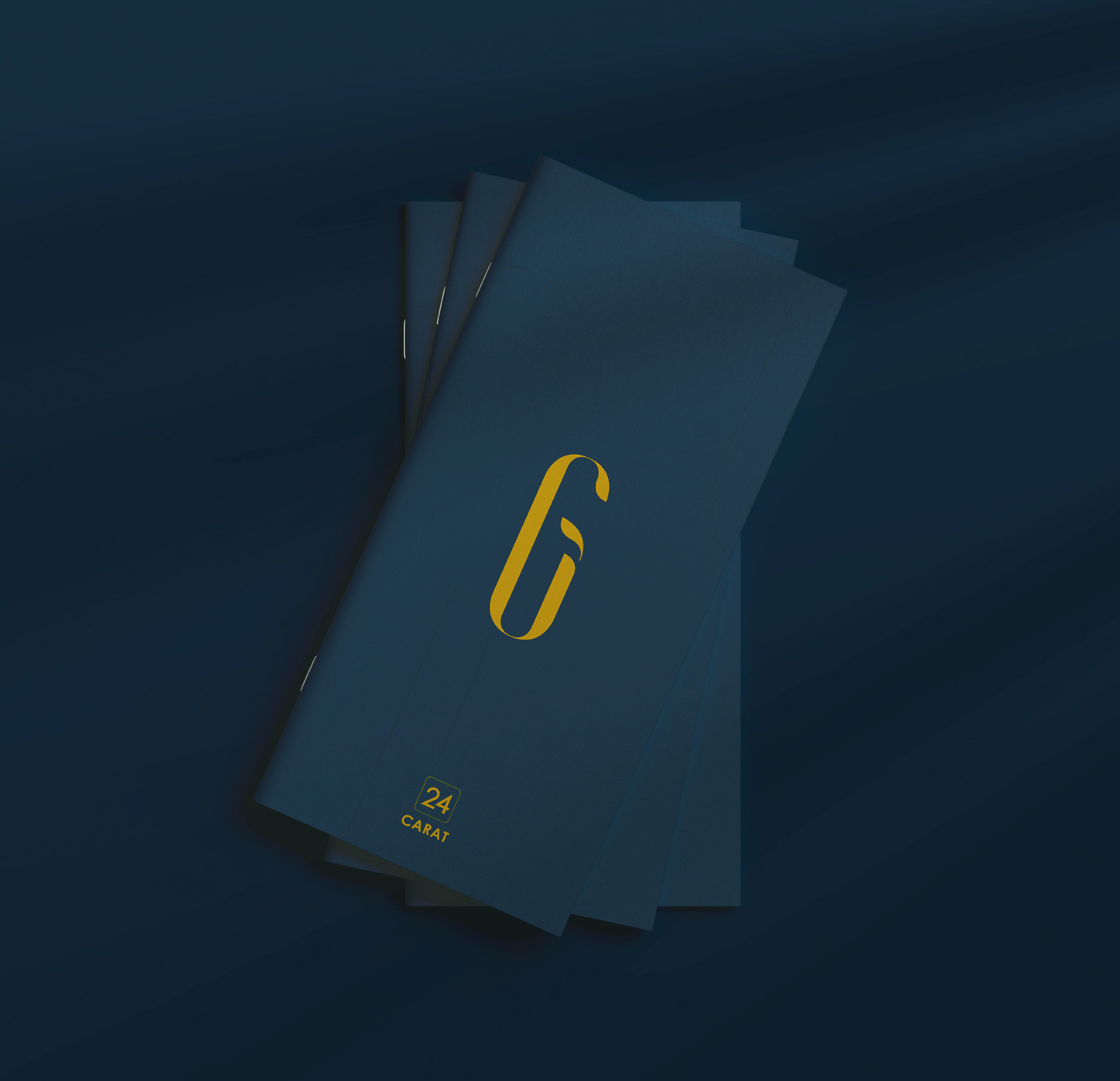
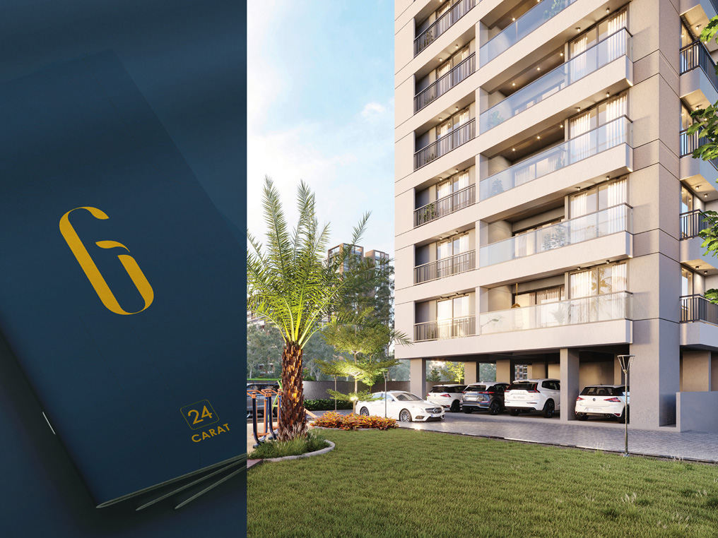
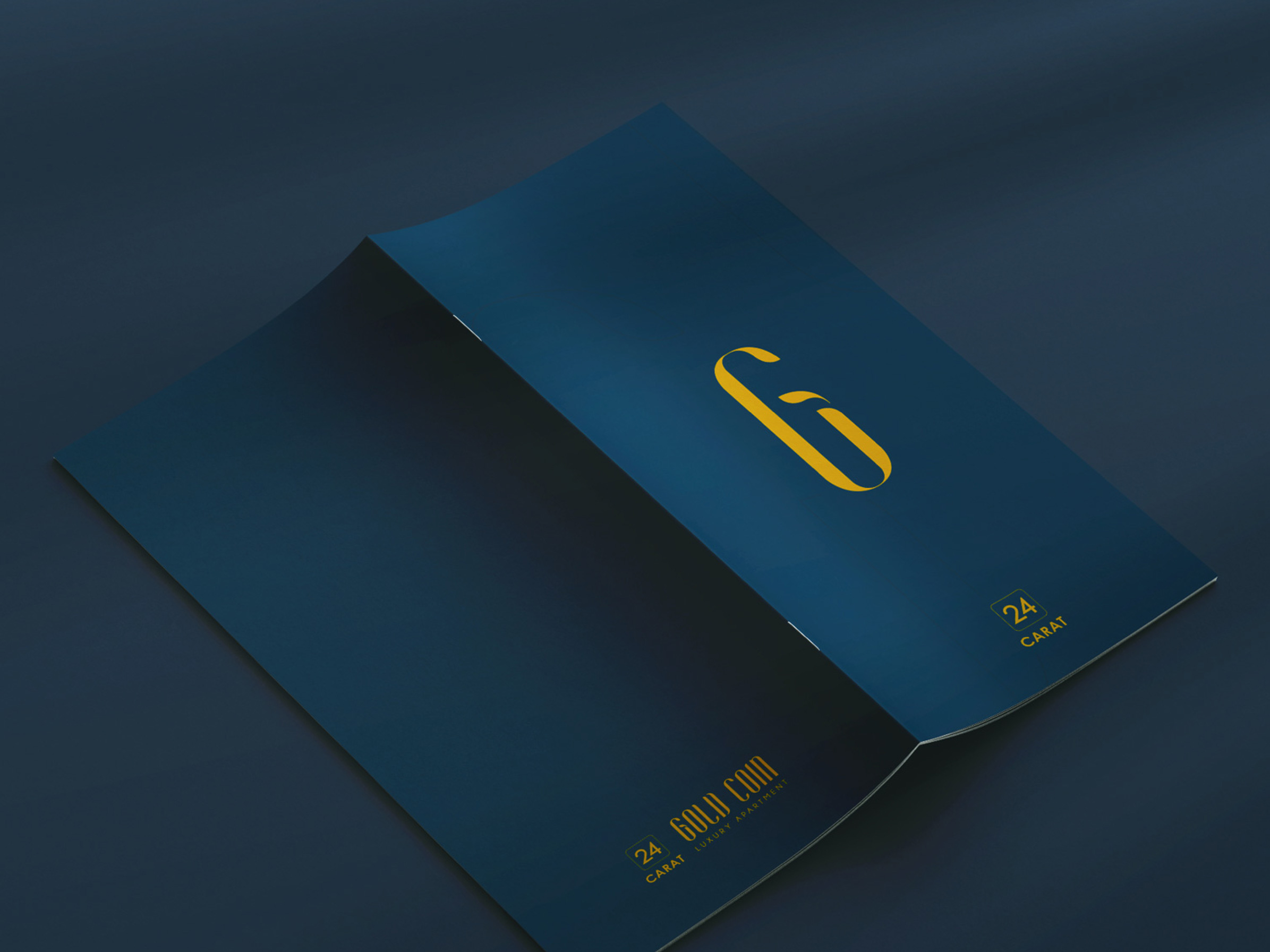
A logo with a story. The tall, slim letters of “Gold Coin” give the logo an elegant, upright character. The “G” carries a small leaf, which brings a touch of nature into a luxury brand. Beside it sits the 24 Carat mark, so the developer’s name stays visible.
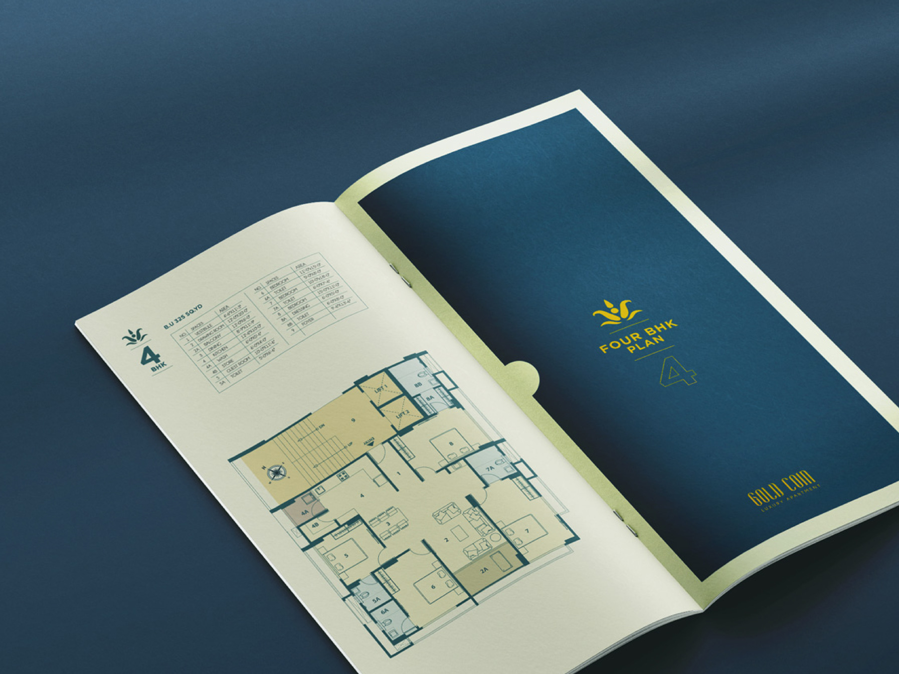
Deep teal and gold. A rich teal paired with a warm gold feels premium without being loud. A soft beige keeps the pages light and easy on the eye.
One look across the brochure. The large “G” is used as a graphic element on the cover and inside pages. Line drawings, simple icons and consistent typography tie the pages together.
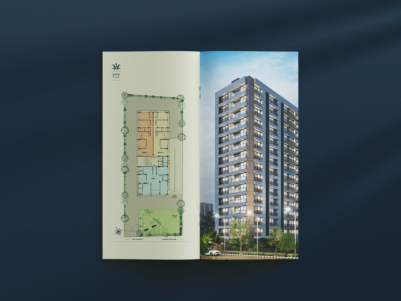
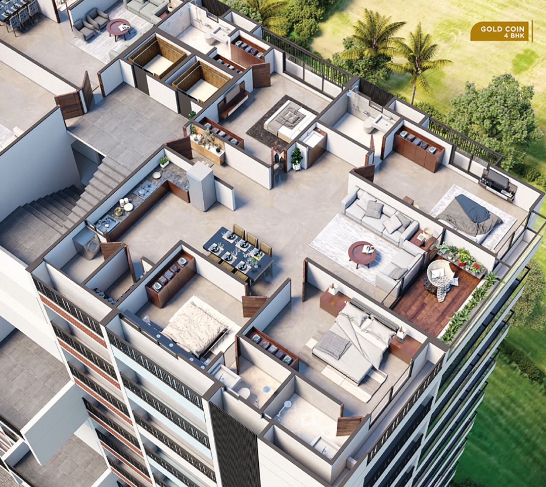
Clear information. Site plan, 3 BHK and 4 BHK plans, terrace plan, highlights, specifications and location map are laid out in one consistent style. Tables, icons and colour coding make the details easy to read.
Outcome
Gold Coin now has a complete identity: logo, colour palette, graphic language and a printed brochure that reflects the quality of the project. The design is elegant and consistent, and it gives 24 Carat, Chavda Developers and Kamal Corporation a confident, premium presence for this project.