
the nature’s palette
Organic, Natural, Gluten-free & Vegan Store
Client: Jinnoni Ventures LLP (the nature’s palette), Ahmedabad, India
Industry: Retail / Organic & Natural Products
Location: Ahmedabad, Gujarat
Our role: Brand identity design
Design: Kruti Raval, Sonar Raval, Pramit Raval
Management & Coordination: Pramit Raval
Instagram: thenaturespalette
Overview: Complete brand identity and store design for an organic retail brand, from logo and stationery to the store itself.
Overview
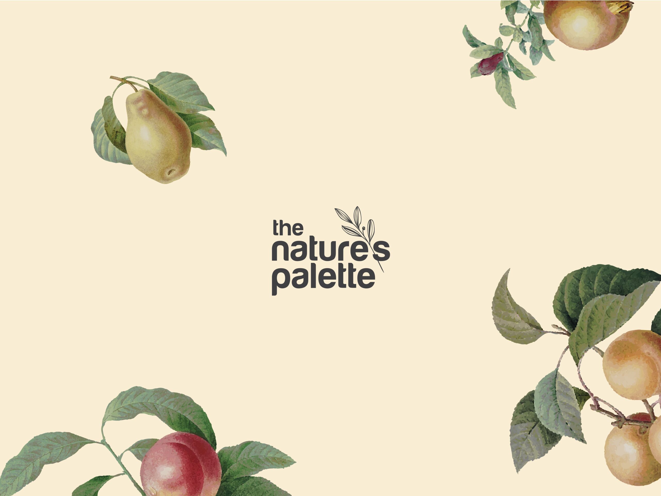
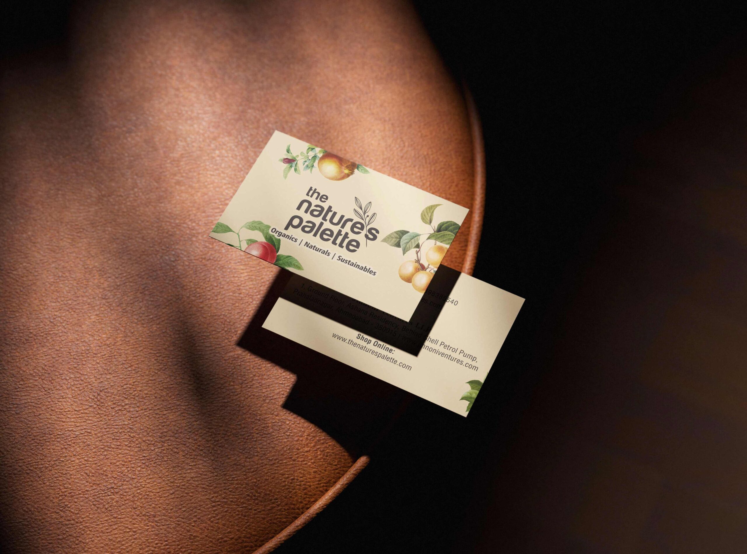
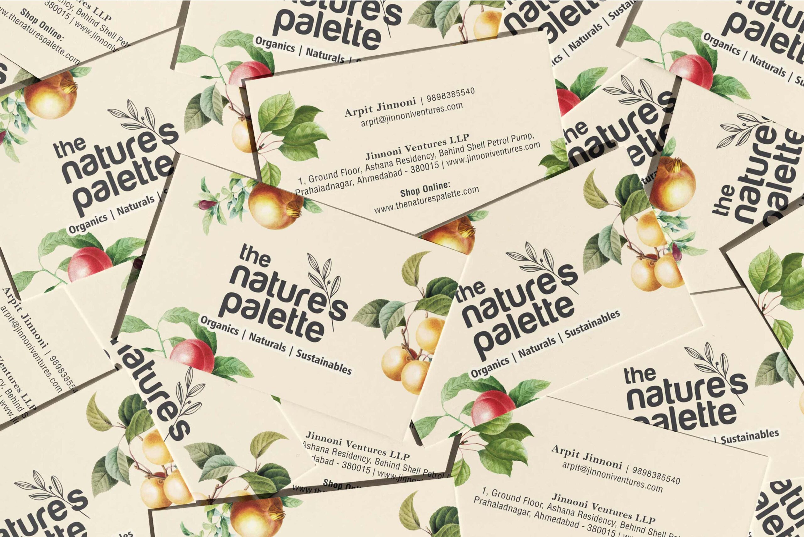
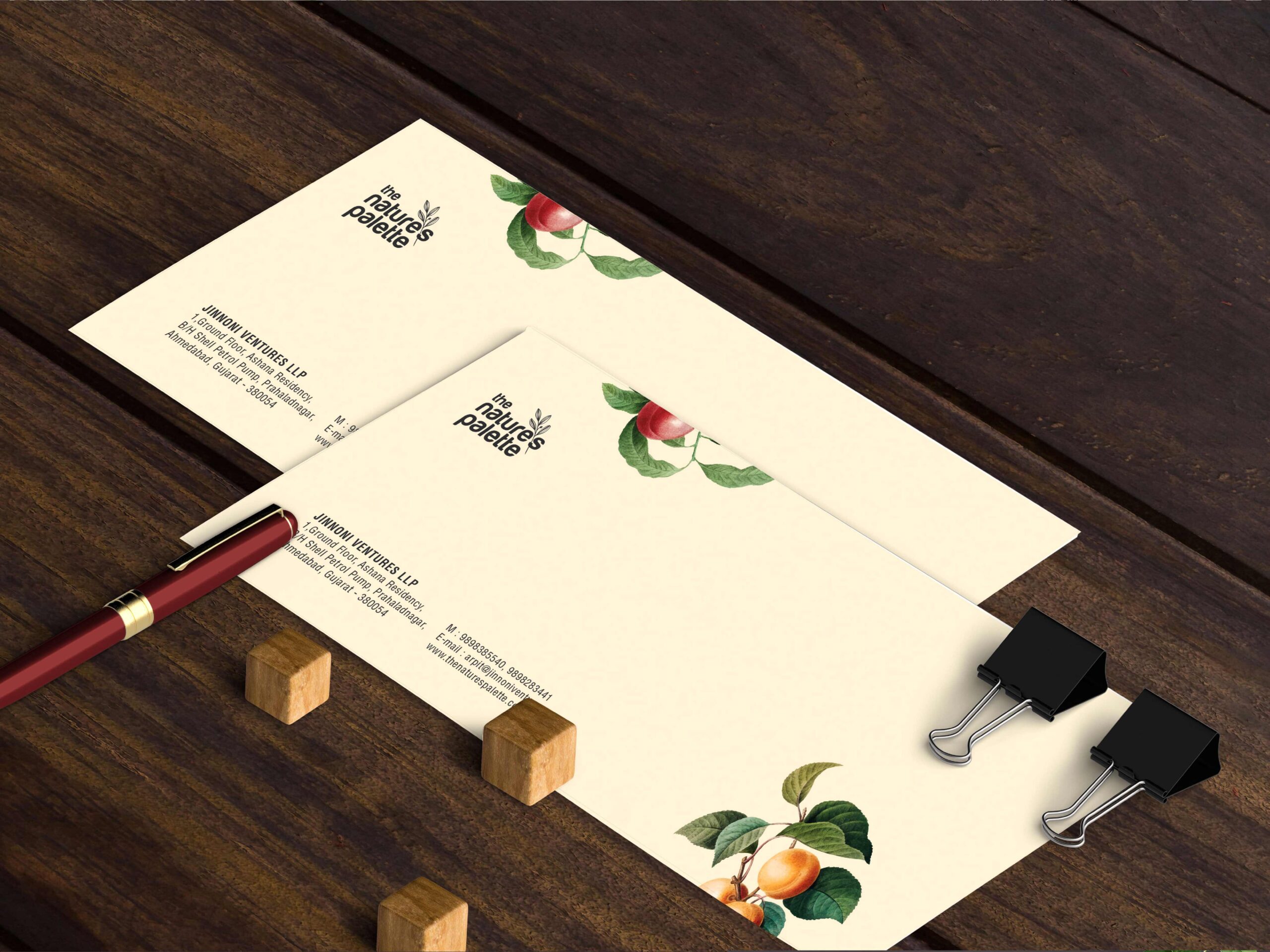
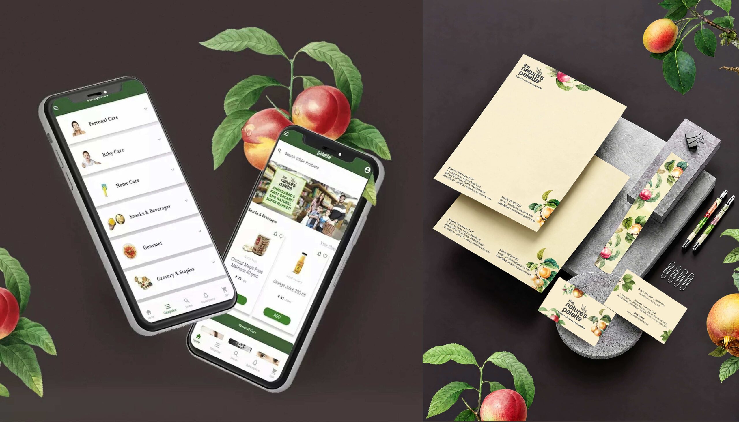
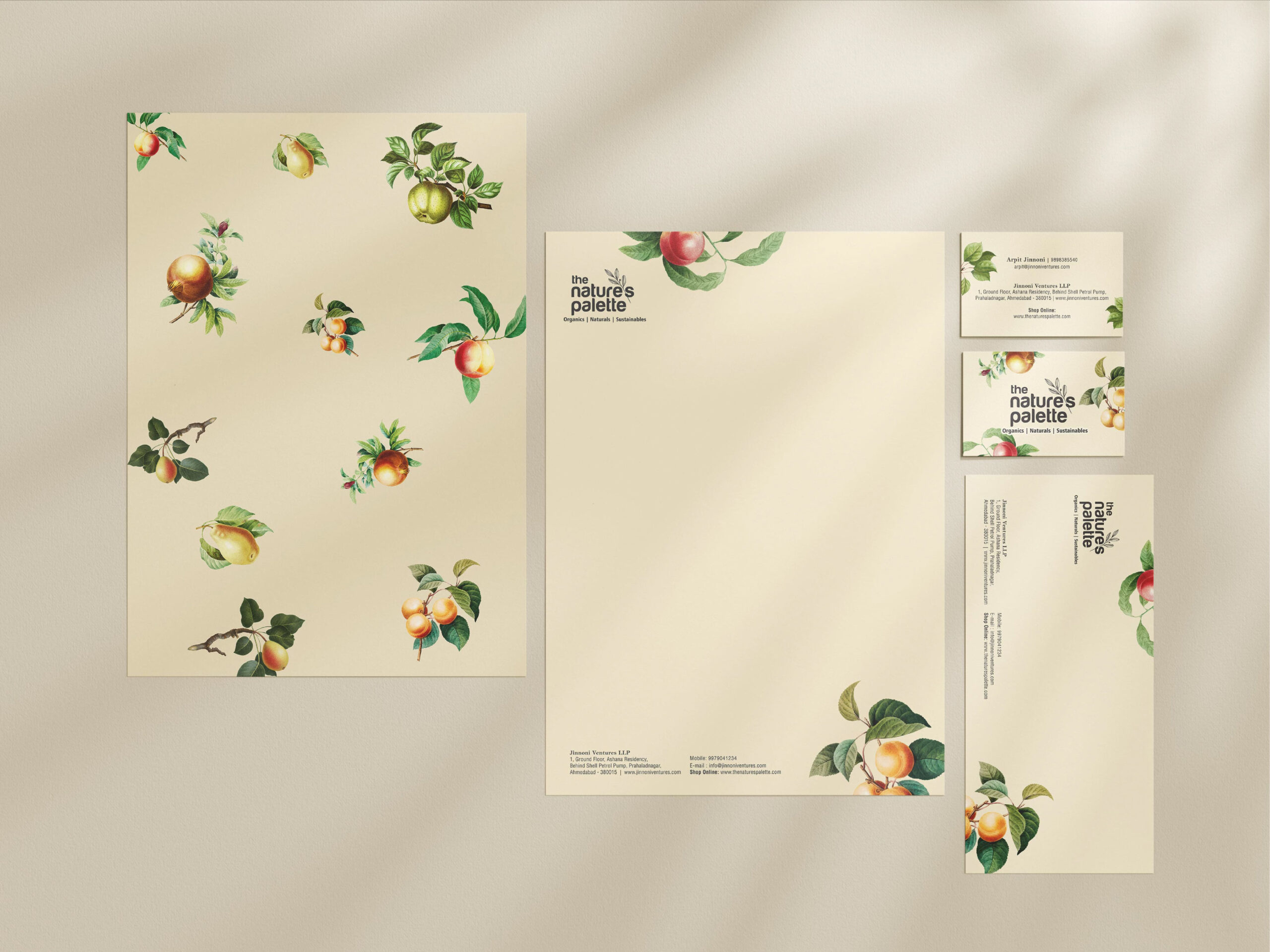
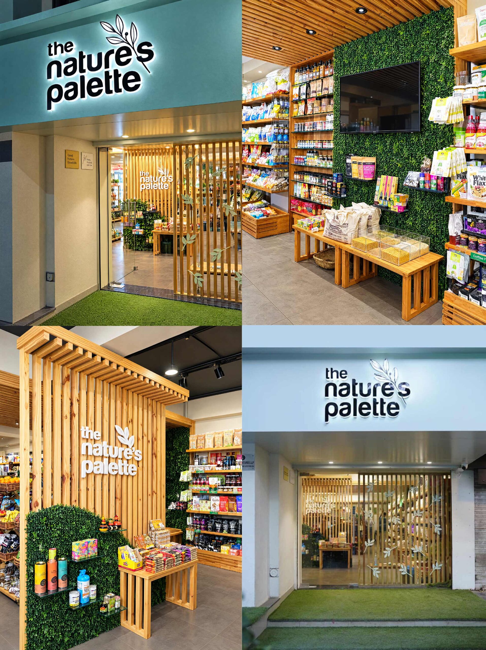
The Nature’s Palette is an organic retail brand based in Ahmedabad, Gujarat, India, built around a simple idea: one place where health-conscious customers can find everything they need. The client approached us on a trusted recommendation, initially for logo design. The relationship grew into full stationery design and brand guidelines to keep every touchpoint consistent, and then into the design and execution of the store itself. We handled the project from the first logo concept to the finished store, as one team.
Challenge
Naming and defining the brand identity took time. It wasn’t clear from the start, and it took many rounds of discussion before the direction was finalised. The client had a clear but demanding vision: he wanted the brand to feel rich, unique and clean, while still being warm and interesting. This was a genuine challenge, since those qualities can easily pull in opposite directions. Because the branding would also be printed at a large scale across packaging and materials, every illustration had to hold up in detail and in production, not just look good on screen.
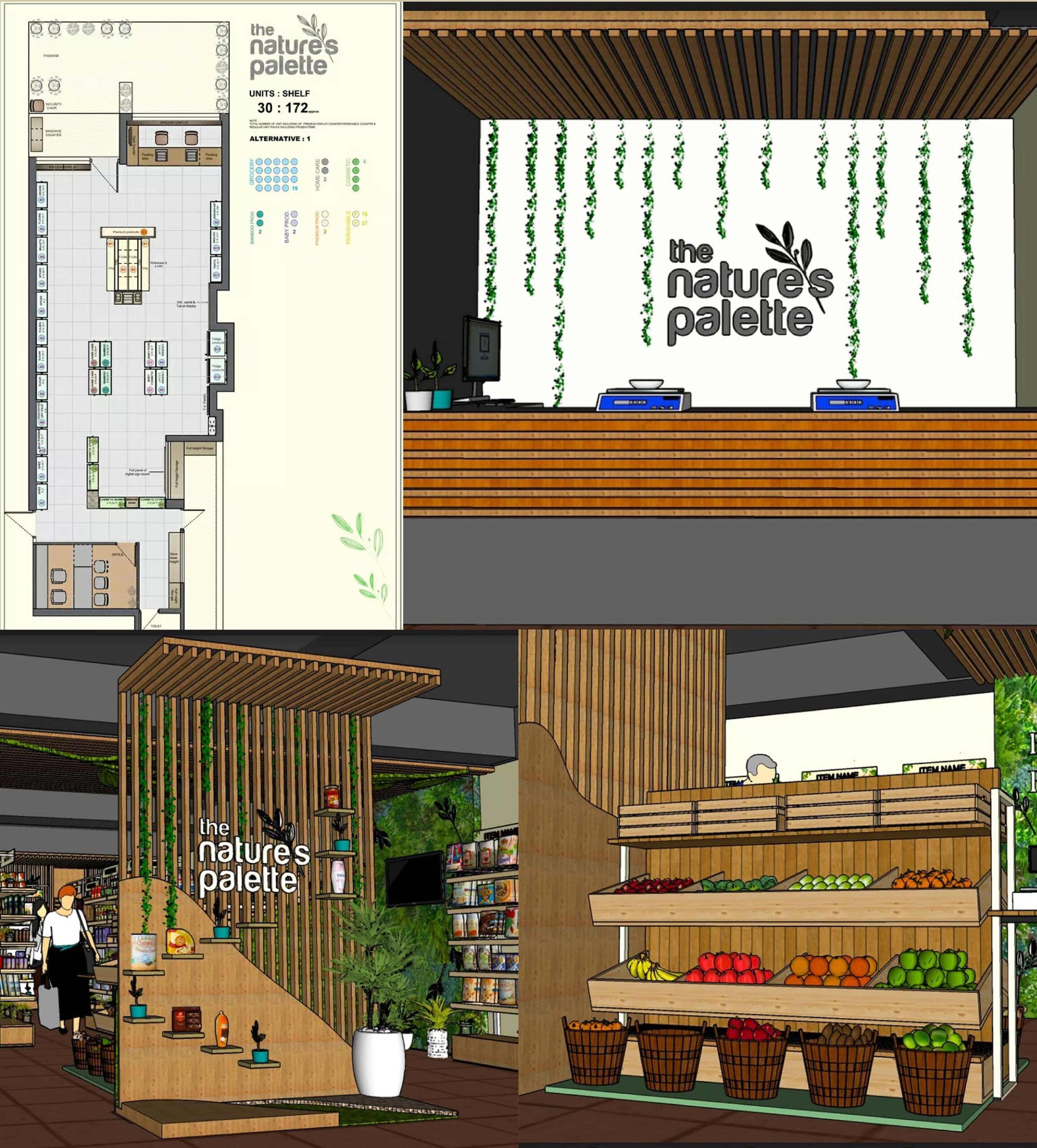
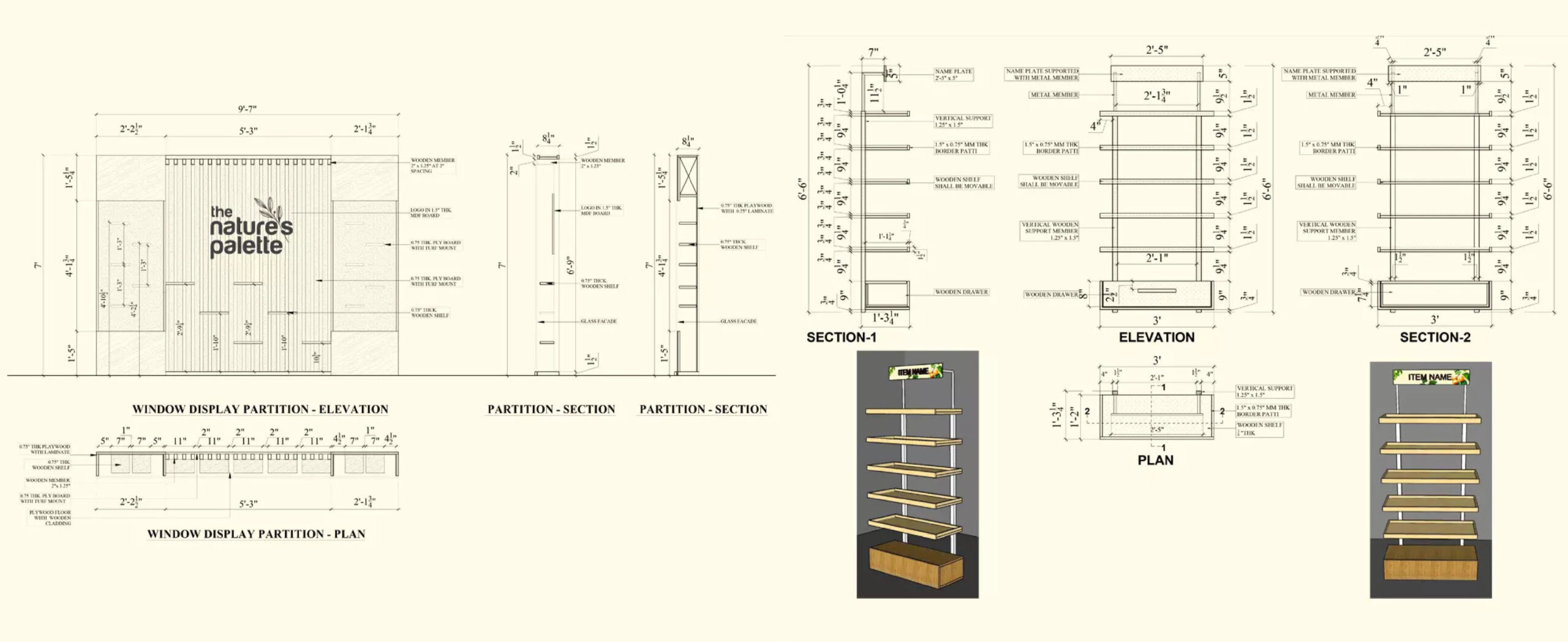
The store added a second challenge. The identity had to work in a real space, and the store design had to follow both the client’s requirements and the needs of the store itself. Every detail had to be planned and carried through on site.
Approach
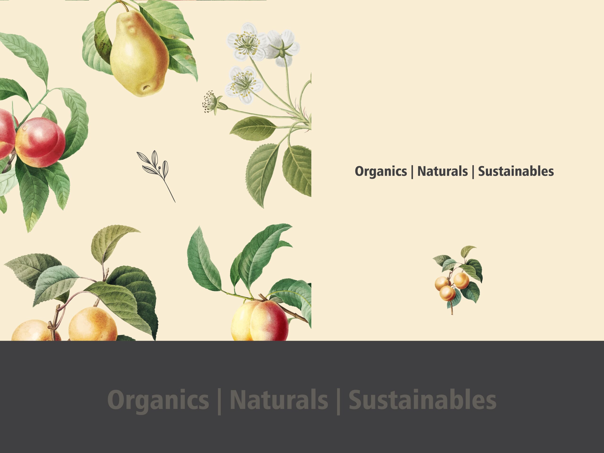
We began by developing multiple distinct logo concepts, each with its own visual direction, so the client could see and compare different ways the brand could look before committing to one. Illustration became the heart of the identity: detailed, colourful yet simple artwork of organic products, designed to draw the eye and add warmth to every application. The goal throughout was a logo that felt bold but carried a rich, layered feel, something that would read as fresh and evergreen wherever it appeared.
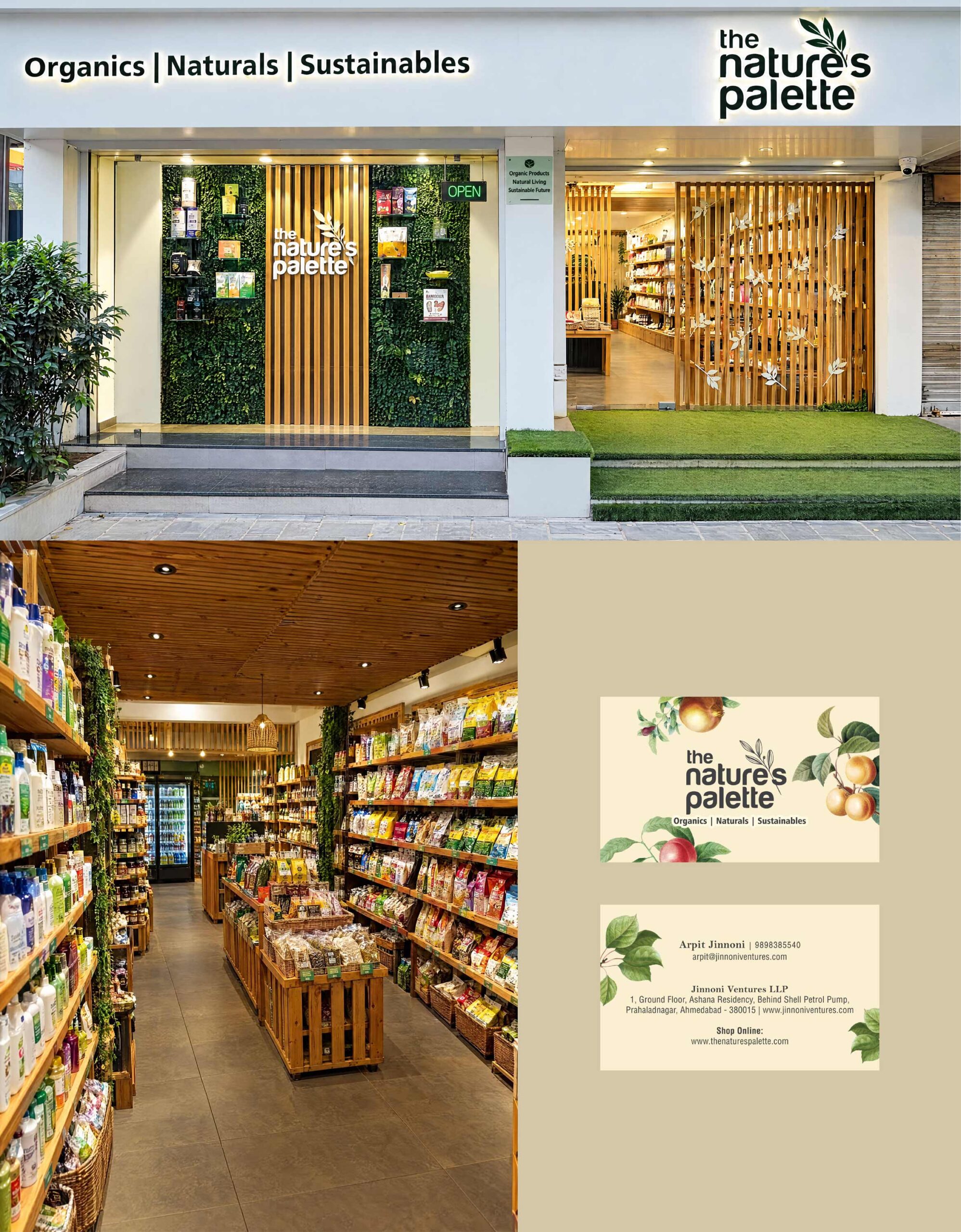
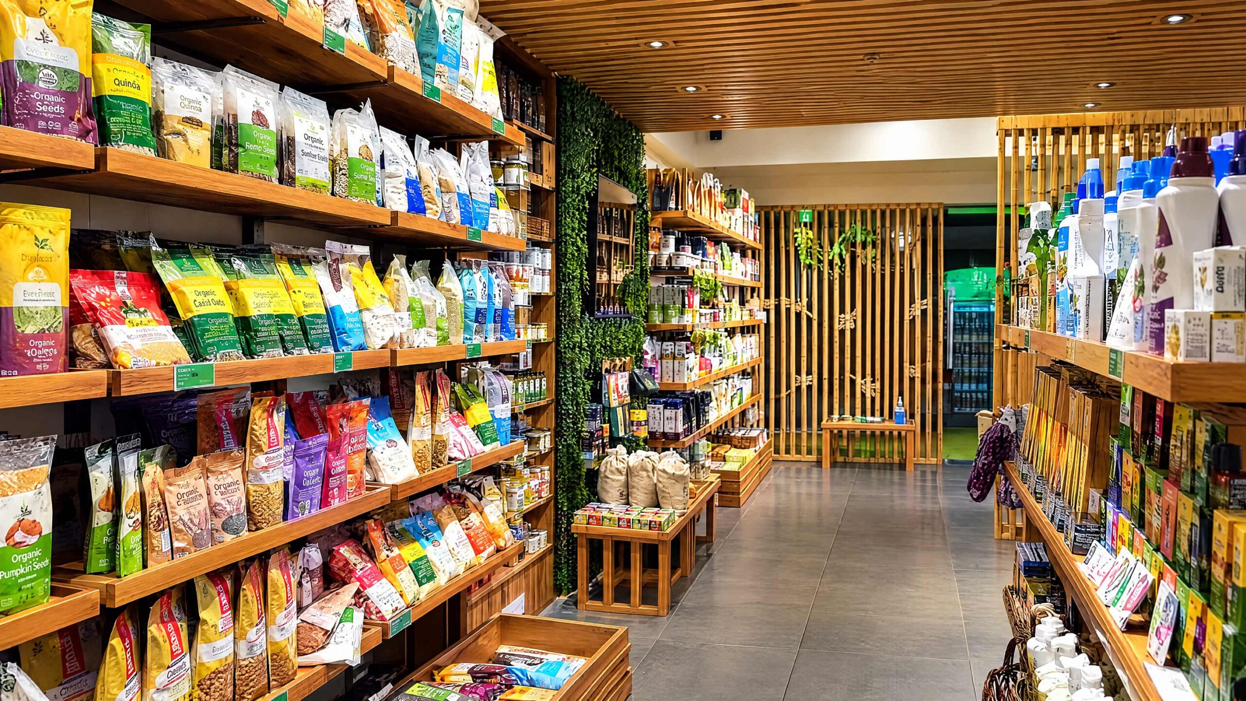
We then carried the same identity into the store. Interior design and execution were handled with the same attention to detail as the brand itself, shaped around the client’s requirements and the needs of the store. Pramit Raval managed the project from start to finish and solved each issue as it came up, so the work moved forward smoothly and the store matched the brand.
Outcome
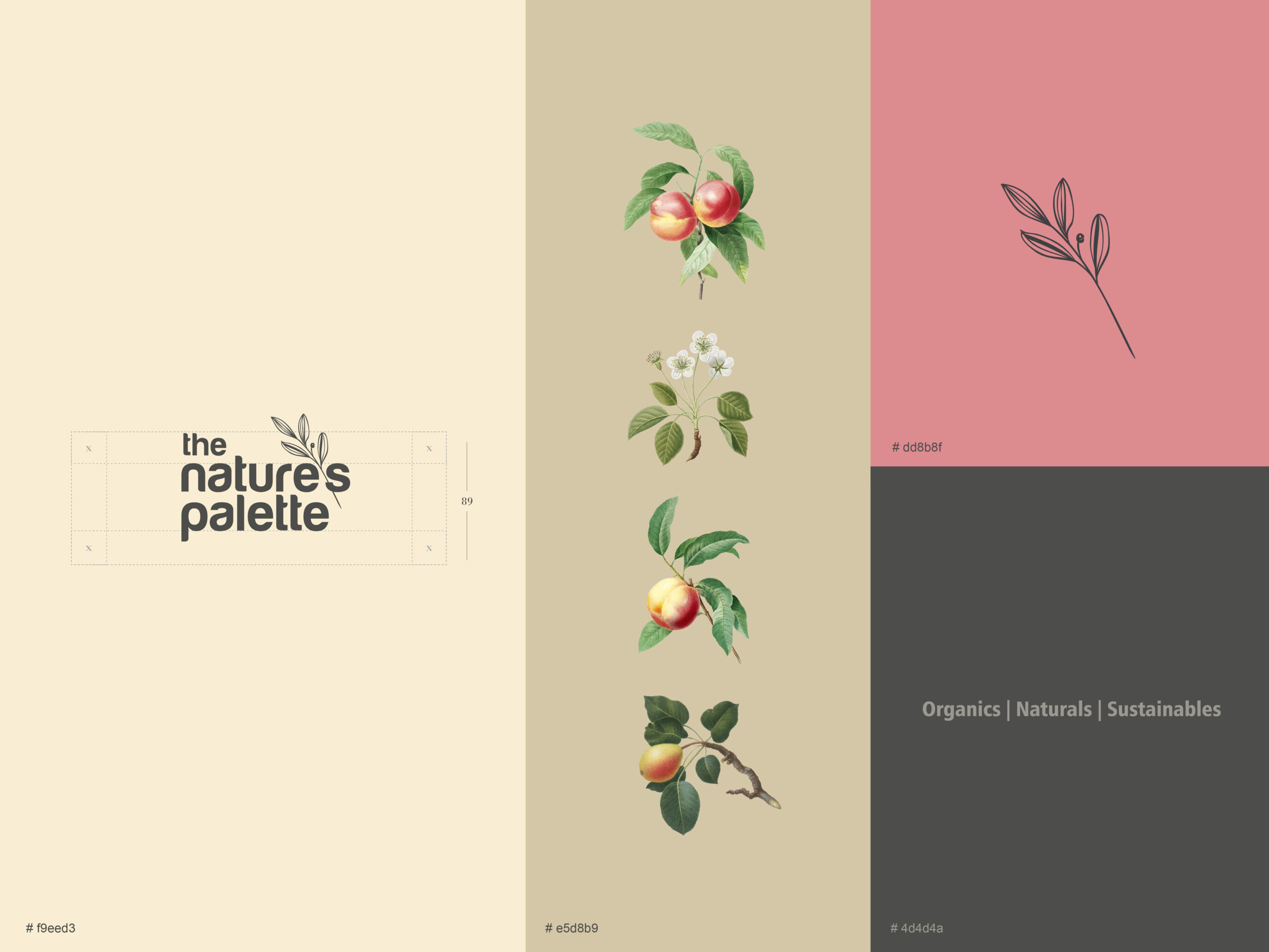
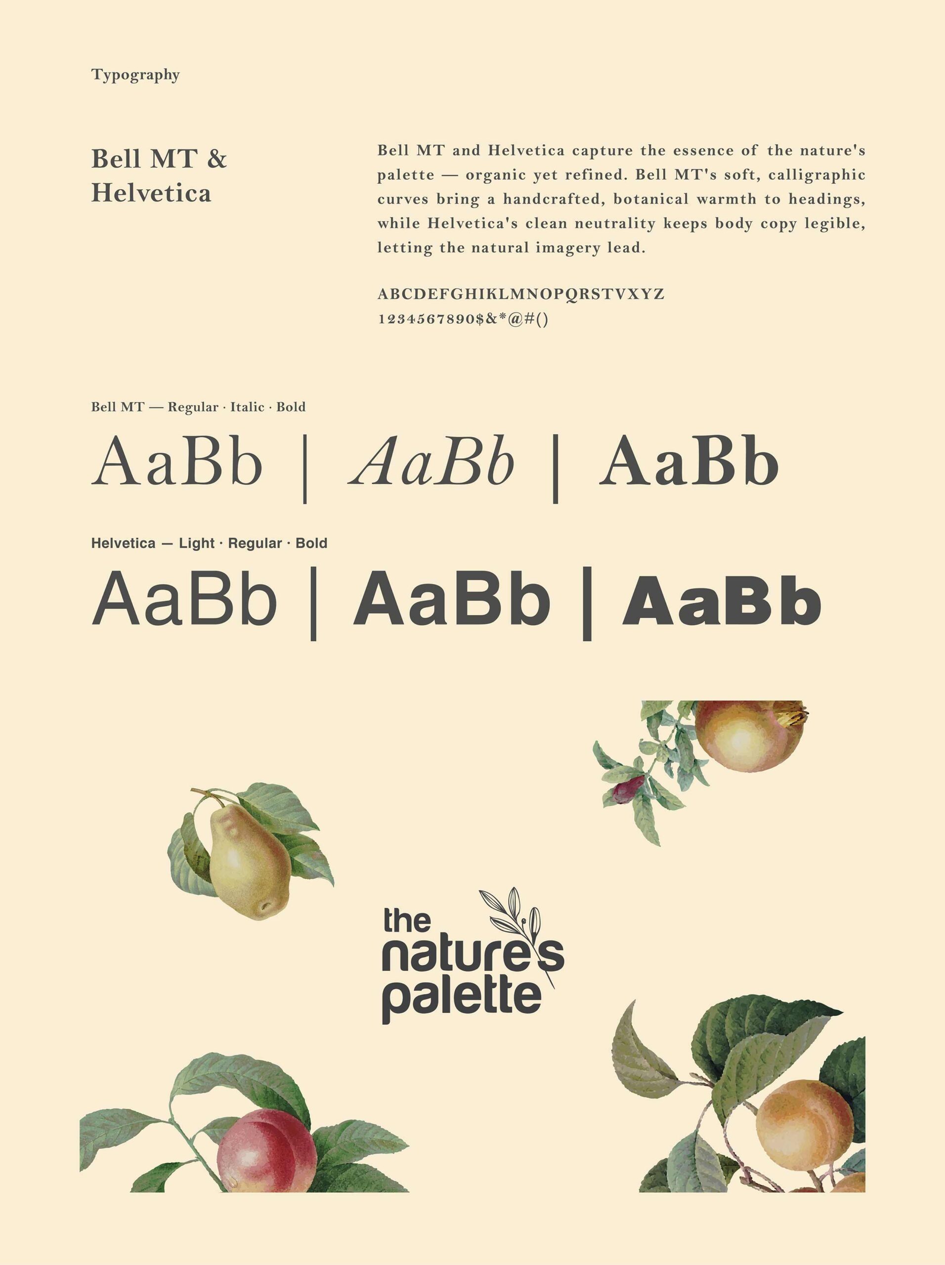
The final identity delivered a complete, print-ready system: logo, stationery and brand guidelines, built to keep every material consistent as the brand grew. The illustrated artwork became the signature element across the brand’s touchpoints. With the store designed and executed to match, the client received one consistent brand experience, from the logo on paper to the space customers walk into.